Taquería in Tucson, Arizona
Tres Limones.
A taquería website.
A loud, sunny homepage for a family taquería: a painted sign headline, a plate of tacos on a marigold sun, hand drawn stickers, and the full menu as one scalloped card. It is online at tres-limones.mymirin.com.
An example made by Mirin. The business is invented.
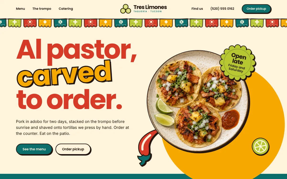
This is the whole website. Scroll inside the window to read it.
What this website gets right.
The menu is the centerpiece, not a link to a PDF: sixteen dishes with Spanish names, plain English descriptions, dotted leaders and real prices, readable on a phone without zooming.
The three things a hungry person needs (today's hours, the address, the phone for pickup) sit in one strip directly under the first screen, and again with the week's hours beside a drawn map.
It looks like the place: papel picado under the header, a headline painted like a sign, stickers on the corners of things, and a catering section that states the minimum, the notice and the price in type you cannot miss.
What it is made of.
- Colors
- Cream
- Tomato
- Marigold
- Teal
- Ink
- Lime
- Type
- Poppins for headings. Inter for reading.
- Sections
- Header, Hero, Info strip, Menu, The trompo, Catering, Find us, Footer.
- Icons
- Sticker drawings, made for this website.