
A good contractor website example is not the one that wins a design award. It is the one that books the job. The best examples all do the same five plain things: they put the phone number where a thumb can reach it, show real photos of real work, prove the service area, carry reviews with first names, and make the quote one tap away.
Most "best contractor website" listicles show you pretty homepages and never tell you why one books work and the next one dies quietly.
So this is the annotated version. Not a gallery. A breakdown of the parts that separate a site a homeowner calls from a site a homeowner closes.
Want to see how your current site scores on these exact parts? Run it through the free Mirin scorecard. Sixty seconds, no signup.
Anatomy of a contractor homepage that books jobs
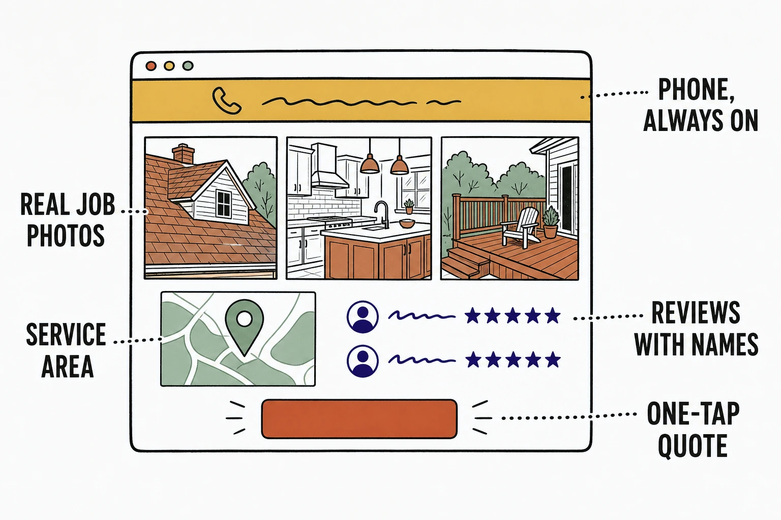
What makes a contractor website example actually good
A contractor website is good when a stranger on a phone can call you in under ten seconds.
That is the whole test. Home service work is urgent, local, and mobile. Around 70% of local searches happen on a phone, and 61% of mobile searchers say they are more likely to contact a business with a mobile-friendly site. The homeowner with a leaking roof is not admiring your typography. They are looking for the number.
So judge every example by the job it does, not the way it looks. The elements below are the ones that do the job. Steal them.
The elements that separate a contractor site that books jobs
Six parts show up in every contractor website example that actually converts.
The phone number that follows you
The number should be visible on every screen, at every scroll position, on mobile especially.
Phone is still how contractor work closes. Callers convert faster and are worth far more than form fills, and 78% of customers hire the company that responds first, per Invoca's home services data. A sticky tap-to-call bar is the single highest-leverage element on the page. Bury the number in a footer and you hand the job to the next result.
Real job photos, not stock handshakes
Show the actual roof, the actual kitchen, the actual crew. Never a stock photo of a smiling stranger in a clean hard hat.
A homeowner is buying proof you can do their specific job. Three real before-and-after shots outperform any hero video. Stock photography says the opposite of what a contractor needs to say, which is "we are real, we are local, and we did this one last week."
Service-area proof, not a vague radius
Name the towns. A homeowner needs to know you cover their street before anything else matters.
"Near me" behavior is now the default: 82% of smartphone shoppers run "near me" searches. A clear list of cities, a map, and the phrase "serving [town] and surrounding areas" answers the first silent question before the visitor has to hunt for it.
Reviews with first names
Reviews with a real first name and a town read as true. A wall of anonymous five-star quotes reads as invented.
Reviews are not optional social proof anymore, they are the gate. Between 93% and 97% of consumers read reviews before buying, and per BrightLocal's 2026 survey, 68% will only use a business with four or more stars. "Dave R., Millbrook, new roof in two days" does more work than a paragraph you wrote about yourself.
The one-tap quote form
For the people who will not call, give them a form so short it feels like one tap. Name, phone, what they need. Nothing else.
Home service web forms convert at roughly 2 to 3%, which means almost everyone who does not call leaves anonymous. Every extra field you add drops that number further. The form is a safety net for the non-callers, not a questionnaire.
Trust badges that actually matter
Licensed, insured, bonded, and the years in business. Those four earn trust. A carousel of vendor logos does not.
A homeowner letting a stranger into their home is managing risk. "Licensed and insured, family-owned since 2009" removes more fear than any award seal. Put the badges that reduce risk near the call button, where the decision happens.
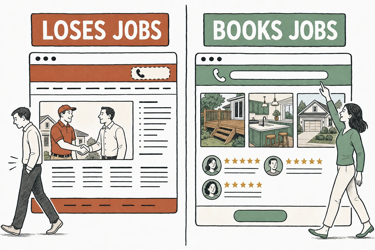
Books jobs versus loses jobs, element by element
The same page section is either working for you or against you. Here is the line between the two, part by part.
| Element | Loses jobs | Books jobs |
|---|---|---|
| Phone number | In the footer, not clickable | Sticky tap-to-call bar, every screen |
| Photos | Stock handshake, smiling model | Real before-and-after of your jobs |
| Service area | "We serve the whole region" | Named towns and a map |
| Reviews | Anonymous five-star quotes | First name, town, the job done |
| Quote form | Eleven fields and a dropdown | Name, phone, what you need |
| Trust | Vendor logo carousel | Licensed, insured, years in business |
The same homepage, two outcomes
See which of the six parts your site is missing.
Send Mirin your site. We grade it against the elements that book contractor jobs, phone, photos, service area, proof, and tell you what to fix first.
Run the free scorecard- Paste your site URL
- We grade it in seconds
- You see the gaps
- You decide
What every winning example has in common
Across the contractor sites we have built at Mirin, the pages that book jobs are boring, and the same part wins every time.
When we add a sticky tap-to-call bar and swap the stock photos for a client's real job shots, the phone becomes the first action, every time. The short quote form settles in as the reliable second. The parts owners are most excited to pay for, the animated hero, the online booking widget, the fourteen-page service tree, are the parts that never generated the first call. Not once, across the builds we have shipped. The call comes from the number and the job photos, or it does not come.
So the best contractor website example is rarely the flashiest one in a gallery. It is the plain one that got the six parts right and stayed out of its own way.
How to use these examples on your own site
Audit your homepage against the six parts before you spend a dollar on a redesign.
Open your site on your phone. Can you call in one tap from any scroll position? Are the photos yours or a stranger's? Are your towns named? Do your reviews have first names? Is the form short? Are the trust badges near the button? Every "no" is a job you are losing for a reason that costs nothing to fix.
If most of the answers are "no," the question is whether to fix the current site or start clean. That is a cost question, and there are four honest ways to answer it: see how much a contractor website costs. And before you judge any example, remember a contractor site has one job to do before the quote, which is prove you are trustworthy, local, and real.
Done right, the handled option folds the build and the upkeep into one line, so the six parts stay true as your service area and prices change. See how that works on Mirin pricing.
See your contractor site rebuilt around the six parts.
Send Mirin your current site. We will shape a preview that gets the phone, the photos, the proof, and the form right, so you can compare the real thing to whatever you have now.
Get my preview- Send your current site
- We shape a preview
- You compare it to your site
- You decide, live in days
The repeatable rule: judge a contractor website example by the job it books, not the award it wins. Get the six plain parts right and the phone rings. Everything else is decoration.

