
Good contractor website design has one job before it asks for anything. Prove the business is trustworthy, local, and real, so a homeowner feels safe requesting a quote. Design that wins quotes puts proof first and the form last.
A homeowner on your site is nervous. They are about to let a stranger into their home and hand over real money.
They are not comparing your fonts. They are asking one quiet question. Can I trust these people?
Answer that question with design, and the quote request takes care of itself. Ask for the quote before you have answered it, and the best-looking site in town still loses the job.
Want to know if your current site earns trust before it asks? Run it through the free Mirin scorecard. Sixty seconds, no signup.
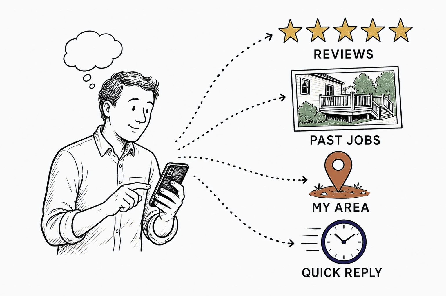
What a homeowner checks before they call
What contractor website design is really for
A contractor website exists to turn a nervous stranger into a booked quote.
That is the whole job. Not to win a design award. Not to list every service in a fourteen-item menu. To move one homeowner from unsure to sure enough to raise their hand.
This matters because the visitor arrives already checking up on you. Seventy five percent of consumers say they always or regularly read online reviews when researching a local business, and only three percent never do. The site is the interview. The homeowner is deciding whether you are believable long before they think about the form.
The mistake most contractor sites make is treating design as decoration. A big hero photo, a slick animation, a slogan about quality and integrity. None of that answers the trust question. It just looks busy while the visitor stays unsure.
Design that wins quotes is design that removes doubt in order. Who are you. Do you work near me. Have you done this before. What do other people say. What happens if I reach out. Answer those, in that order, and the quote is the easy part.
Prove trust before you ask for the quote
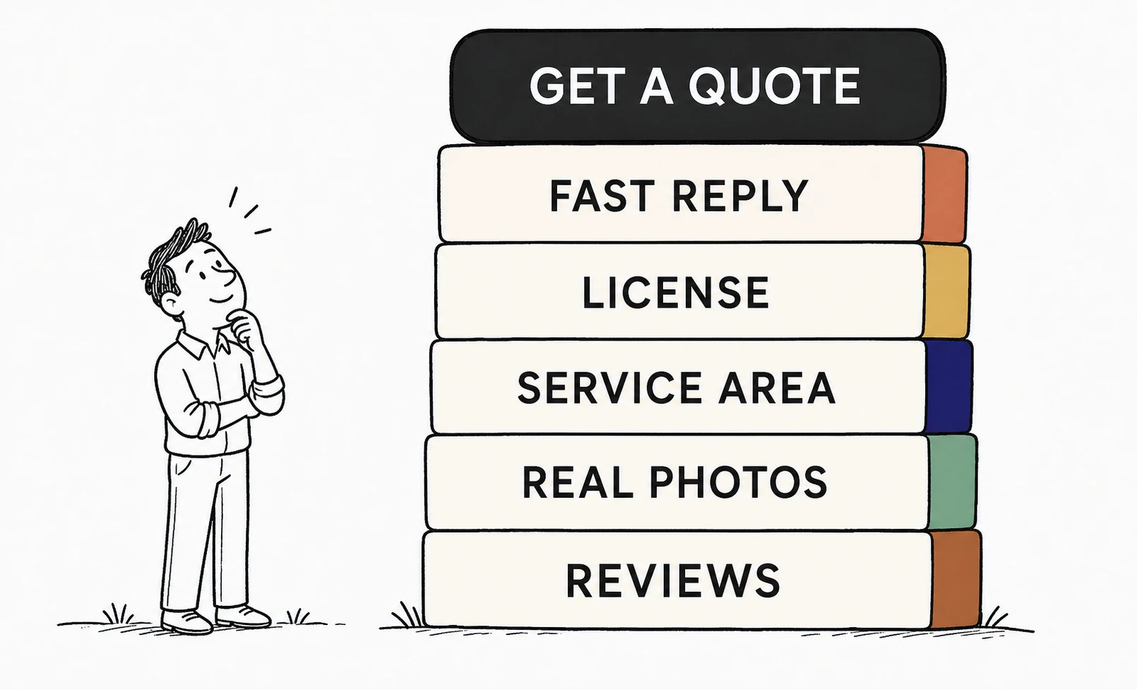
The quote form is the last thing a homeowner should meet, not the first.
Trust is not a badge you paste in the footer. It is a stack, and each layer holds up the one above it. Reviews prove you are real. Real photos prove you do the work. A service area proves you cover their street. A license proves you are legitimate. A fast reply proves you will actually show up.
Only when that stack is standing does a homeowner feel safe pressing the button. This is why reviews carry so much weight in home services. Around half of consumers trust online reviews as much as a personal recommendation from a friend, most read at least two review sites before deciding, and they expect at least a four star average to consider you at all. When strangers vouch for you, the visitor borrows their confidence.
The trust stack a contractor site needs before the quote
Photos do more of this work than most contractors think. A gallery of real, finished jobs, shot on a phone, beats a stock image of a model in a clean hard hat every time. Homeowners say their hardest part of hiring a pro is simply finding someone they trust, and real project photos are the fastest way to earn it. The homeowner is picturing their own house. Show them one that looks like it.
So the design order is proof first, ask last. Put the reviews, the real work, and the service area where the visitor lands. Put the form after they already believe you.
See your contractor site designed to earn trust first.
Send Mirin your current site. We will shape a preview that leads with proof, service area, and real work, so the quote form lands after the homeowner already believes you.
Request a website preview- Send your site
- We shape a preview
- You review it
- You decide
Design it for the phone in the driveway
Most homeowners meet your site on a phone, often standing in the problem.
A leak under the sink. A deck that failed inspection. A furnace out in January. They search on the device in their hand, in the room where the trouble is. And they leave fast when the page fights them: 53 percent of mobile visits are abandoned if a page takes longer than three seconds to load. If your site is slow, cramped, or hides the phone number, they are already dialing the next result.
Contractor website design that wins quotes is mobile design first. A phone number that follows the visitor down the screen. Tap-to-call that actually calls. Photos that load fast on a driveway signal. A form short enough to finish with a thumb.
The desktop version is the courtesy copy. The phone is where the job is won or lost.
Which design elements actually win the quote
Across the contractor and home-services sites we have rebuilt at Mirin, one design change moves quote requests more than any other. Moving proof above the fold.
The sites that lead with a stock hero and a slogan lose the visitor before the first scroll. When we rebuild the same page to open with three real job photos, two reviews that use first names, and the service area in plain text, quote-form starts climb sharply. Same business, same services, same prices. The only change is what the homeowner sees first.
The second pattern is quieter. The contractors who reply fast win more of the quotes they do get. A classic Harvard Business Review audit found the average business took 42 hours to respond to a web lead and 23 percent never responded at all, while firms that answered within an hour were seven times likelier to qualify the lead. A form that emails an inbox nobody checks until Sunday is design that loses on speed, no matter how it looks.
So the winning elements are not exotic. Real photos, named reviews, a visible service area, tap-to-call, and a promise about response time. Design decides which of those the visitor sees first, and first is what wins the quote.
Design a site that stays true after launch
A contractor website is only honest on launch day unless someone keeps it current.
You finish a job worth showing. You add a service. You expand into the next town. Your best review comes in this week. Every one of those is a design change, and a site that cannot absorb them quietly goes stale. A stale site spends the trust a fresh one builds.
This is one reason so many trades still limp along on an outdated site, or none at all. Roughly a quarter of small businesses still have no website, and among the ones that do, plenty are frozen years behind the real business. Updating means logging into a builder at night, or emailing a developer and waiting on an invoice. So it never changes, and the proof stops growing.
The better design is a site you keep true in plain language. You say what changed, a new job, a new town, a new review, and it gets published. You keep the business judgment. You do not become the webmaster. That is the model Mirin runs, and it is why the proof on a Mirin contractor site keeps compounding instead of aging.
Where Mirin fits for contractors
Mirin designs and runs the site so a contractor never has to.
You bring what no template can guess: the jobs you are proud of, the towns you cover, the reviews worth featuring, the promise you can keep on response time. Mirin turns that into a page built in trust order, proof first and the quote last, and keeps it current as the business grows.
The work is judgment, not decoration. Which three photos lead. Which review earns the top spot. Where the phone number lives on a phone. Get those right and the site stops being a brochure and starts booking quotes.
If you are weighing what this should cost, see how much a contractor website costs in plain numbers. If you want to see the design ideas as real pages, browse contractor website examples. And the Mirin Journal keeps the rest of these field lessons together.
See your contractor site rebuilt to win quotes.
Send Mirin your current site. We will shape a preview that proves trust before it asks, so you can compare it to whatever you are running now.
Get my preview- Send your current site
- We shape a preview
- You compare it to your site
- You decide, live in days
The repeatable rule: design in trust order. Prove you are real, local, and proven before you ask for the quote, and the homeowner presses the button you were afraid to show them.


