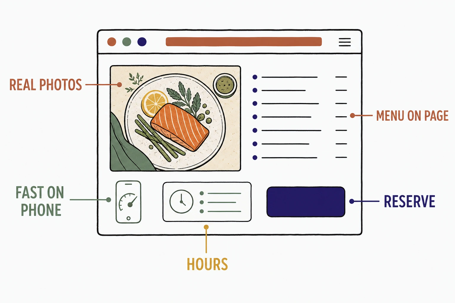
The restaurant website examples that fill tables all do five plain things: they put the full menu on the page, they load fast on a phone, they make one action obvious (reserve or order online), they show real food, and they state the hours and location. Design polish is optional. Those five parts are not.
Most "best restaurant website" roundups show you dark, cinematic homepages with a slow video and never explain why one keeps a full book while a prettier one sits half empty.
So this is the annotated version. Not a gallery of moody hero shots. A breakdown of the parts that make a hungry person stop scrolling and decide to eat with you tonight.
Want to see how your current site scores on these exact parts? Run it through the free Mirin scorecard. Sixty seconds, no signup.
Anatomy of a restaurant homepage that fills tables
What makes a restaurant website example actually fill tables
A restaurant website fills tables when a hungry stranger can tell, in under a minute and usually on a phone, what you serve, whether it is open, and how to reserve or order, without calling to find out.
That is the whole test. Nobody picks the first restaurant they see. They open three tabs, look for the same answers in each, and eat with the one that answers first. Stanford's web credibility research found that people judge a site's trustworthiness largely from its design and presentation, and they do it fast. The judgment is not about how cinematic the page feels. It is about whether the page answers questions or dodges them.
The stakes are real, because the market is crowded. The National Restaurant Association projected industry sales would top $1.1 trillion in 2024 across more than 700,000 locations. In a town with a dozen options for the same craving, the site that answers first gets the table.
The elements every table-filling restaurant website has
Five parts show up in every restaurant website example that turns a browsing stranger into a booked table or a placed order.
The full menu, on the page
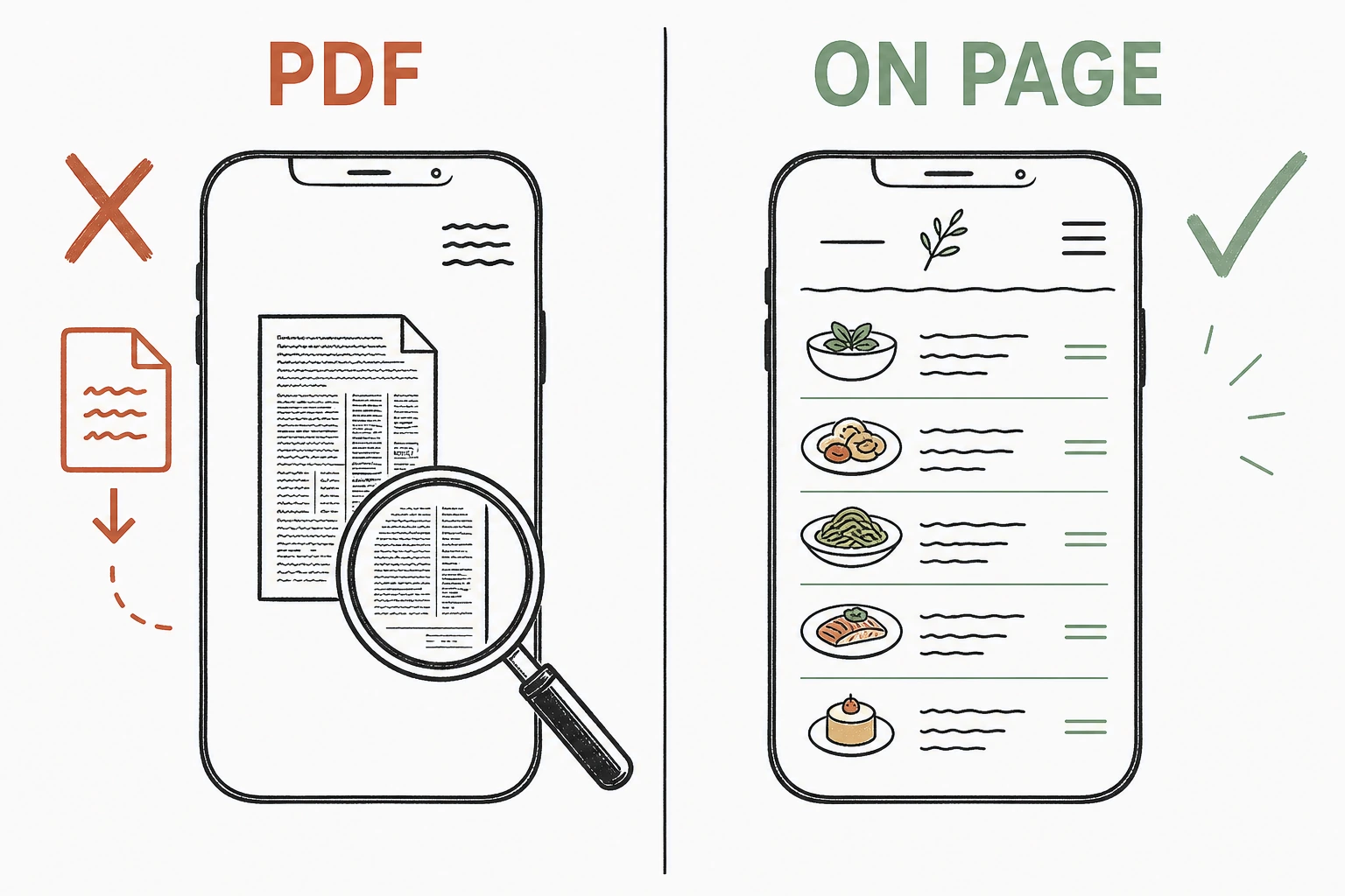
Put the whole menu in real text on the site. Not a downloadable PDF, not a photo of a chalkboard, not "call for today's specials."
The menu is the single most wanted thing on a restaurant site, and hiding it behind a slow PDF is the fastest way to lose a hungry visitor to the next tab. Digital agency MGH's survey of diners found the majority check a restaurant's website before they visit, and the menu is what they came for. A PDF that pinches and zooms on a phone reads as a dead end. On-page text reads as an open door.
The menu as a dead end versus the menu as an open door
A page that loads fast and clean on a phone
Most people deciding where to eat are standing up, holding a phone, and in a hurry. Build for that first.
The cinematic autoplay video that looks great on a designer's monitor is the thing that stalls on a phone on restaurant Wi-Fi, and a stalled page is a lost table. Google's benchmarks found 53% of mobile visitors abandon a page that takes more than three seconds to load. A restaurant homepage that makes someone wait is a homepage that sends them to the place next door that loaded.
One obvious action: reserve or order
The call to action should be one loud button that says what happens next. "Reserve a table" or "Order online" works. A phone number buried in the footer does not, and neither does a reservation widget three taps deep.
The person deciding between three restaurants will go with whichever one makes the next step easiest. If they want a table tonight and cannot find a booking button in five seconds, they book the restaurant that made it obvious. One clear action beats a page full of polite options.
Real food photos, not stock plates
Show your actual dishes, shot in your actual room. Not a stock library steak that arrives at no table you own.
Food photography is the most persuasive thing on a restaurant site and the fastest way to break trust when it is obviously borrowed. A diner can feel the difference between a real plate from your kitchen and a glossy stock image, and the borrowed one plants the exact doubt you are trying to remove. Real photos let a visitor picture the meal. Stock photos make them wonder what you are hiding.
Hours and location, impossible to miss
State when you are open and where you are, in text, near the top. Reviews carry the reputation, but hours and address carry the visit.
Shoppers lean hard on reviews, as BrightLocal's local consumer review research shows year after year, but a five-star average does not tell a hungry person whether your kitchen is open right now. The single most common reason a ready-to-eat visitor bounces is a site that makes them dig for the hours. Put them where the eye lands.
Fills tables versus loses them, element by element
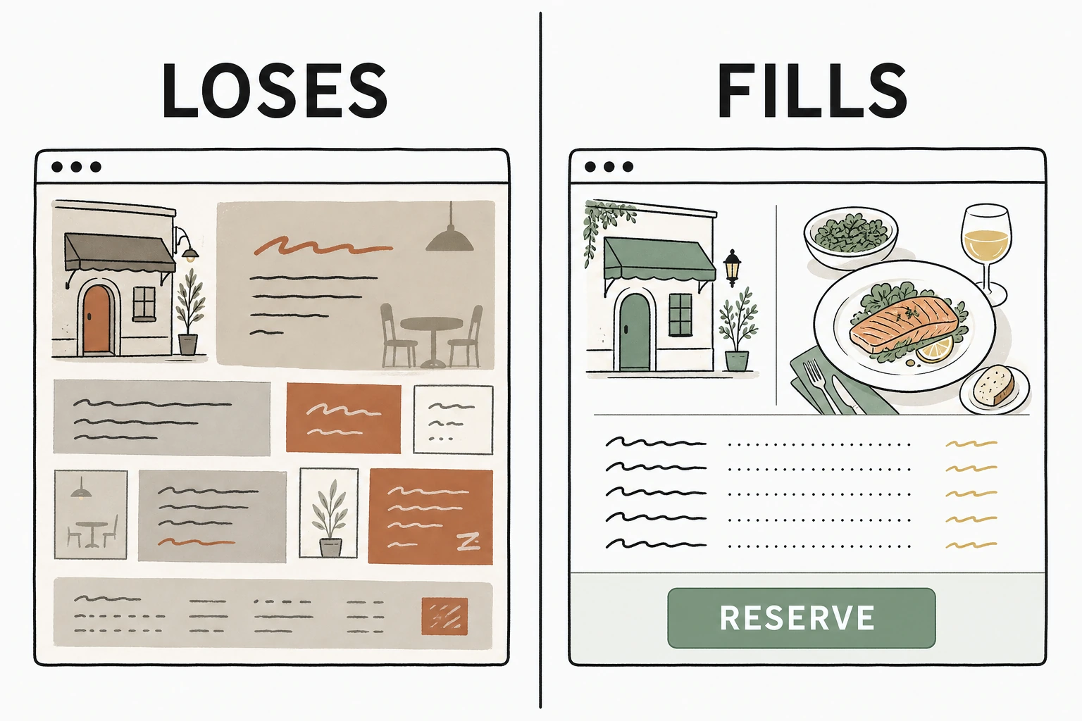
The same section of the page is either lowering the barrier to a visit or raising it. Here is the line between the two, part by part.
| Element | Loses the table | Fills the table |
|---|---|---|
| Menu | A slow downloadable PDF | The full menu in on-page text |
| Mobile | An autoplay video that stalls | A fast page that loads clean on a phone |
| Action | A phone number in the footer | One clear "Reserve" or "Order" button |
| Photos | Stock plates from a library | Real dishes from your kitchen |
| Hours | Buried on a contact page | Hours and address near the top |
| Headline | "A culinary journey awaits" | What you serve and where you are |
The same restaurant, two homepages
See which of the five parts your restaurant site is missing.
Send Mirin your site. We grade it against the parts that turn a hungry stranger into a booked table, your menu, your mobile speed, your booking step, your photos, your hours, and tell you what to fix first.
Run the free scorecard- Paste your site URL
- We grade it in seconds
- You see the gaps
- You decide
What every table-filling restaurant example has in common
Across the restaurant homepages we have built at Mirin this year, the same swap wins every time, and it is never the one the owner expects.
Owners come to us wanting a longer intro video, a darker palette, a slideshow of the dining room at dusk. What actually moves reservations and online orders is blunter. We take the menu out of the PDF and lay it on the page in real text, we put one "Reserve" or "Order online" button where the thumb lands first, and we move the hours and address above the fold. On the sites we have shipped, those three edits are what turn a quiet page into booked tables. The cinematic intro never did it once. The readable menu, the button, and the hours did.
Donald Miller puts the underlying rule bluntly in Building a StoryBrand: "If you confuse, you'll lose." A hungry person comparing three restaurants is looking for a reason to stop, and clarity is that reason. In a market of more than 700,000 places to eat, the clearest site, not the prettiest, is the one that gets the table.
So the best restaurant website example is rarely the most beautiful one in a roundup. It is the one that answers a hungry stranger's three questions before they think to ask.
How to use these examples on your own site
Audit your homepage against the five parts before you touch the design.
Open your site on your phone. Can a visitor read the full menu without downloading anything? Does the page load before they lose patience? Is there one obvious button to reserve or order? Are the photos your real food? Are the hours and address near the top? Every "no" is a table that quietly went to the restaurant in the next tab.
If most of the answers are "no," start with the parts that do the deciding. The menu comes out of the PDF first, then the booking button, then the hours. And if you are still collecting quotes to build the thing, here is what a small business website should actually cost so you know what you are paying for.
Done right, the handled option folds the build and the upkeep into one line, so the five parts stay true as your menu, your hours, and your specials change. See how that works on Mirin pricing, or how the handled model runs on the Mirin platform page.
See your restaurant site rebuilt around the five parts.
Send Mirin your current site. We will shape a preview that gets your menu, your mobile speed, your booking step, your photos, and your hours right, so you can compare the real thing to whatever you have now.
Get my preview- Send your current site
- We shape a preview
- You compare it to your site
- You decide, live in days
The repeatable rule: judge a restaurant website example by whether it answers a hungry stranger's three questions, what you serve, whether you are open, and how to reserve or order. Get those five plain parts right and the tables fill. Everything else is wrapping paper.


