
The best therapist website examples all share five plain parts: a real photo of the therapist, one clear sentence about who they help, honest answers about fees and insurance, credentials written like a human, and a first step that feels safe to take. Design polish is optional. Those five parts are not.
Most "best therapist website" roundups show you soothing color palettes and never explain why one site fills a caseload while a prettier one sits silent.
So this is the annotated version. Not a gallery of calm beige homepages. A breakdown of the parts that make a nervous stranger decide you are the one to call.
Want to see how your current site scores on these exact parts? Run it through the free Mirin scorecard. Sixty seconds, no signup.
Anatomy of a therapist homepage that gets clients
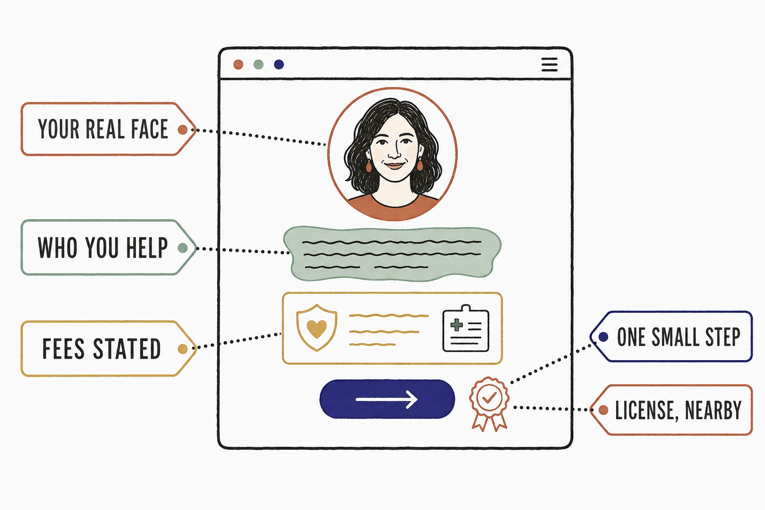
What makes a therapist website example actually good
A therapist website is good when an anxious person at 11pm can tell, in under a minute, that you help people like them and that reaching out will not hurt.
That is the whole test. Someone searching for a therapist is often at a low point, comparing tabs, and looking for a reason to trust. Stanford's web credibility research found that people judge a site's trustworthiness largely from its design and presentation, and they do it fast. The judgment is not really about aesthetics. It is about whether the page feels like a person or a brochure.
So judge every example by the feeling it creates in a hesitant visitor, not by the mood board. The elements below are the ones that create it. Steal them.
The elements that separate a therapist site that fills a caseload
Five parts show up in every therapist website example that actually converts a visitor into a consult.
Your real face, above the fold
The single most important image on a therapist website is a warm, current photo of the therapist. Not a beach. Not a lighthouse. Not stones stacked by a stream.
A prospective client is not choosing a logo, they are choosing a person to sit across from at their most vulnerable. A real portrait answers the first silent question, "who will I be talking to," before a word is read. The stock ocean photo answers nothing, and every other therapist in town is using the same one.
One sentence that names who you help
The headline should say who you help and with what, in plain words. "Therapy for anxious professionals in Austin" beats "A safe space for healing and growth" every time.
Donald Miller puts the rule bluntly in Building a StoryBrand: "If you confuse, you'll lose." Vague poetry reads as evasion to a visitor who needs to know, right now, whether you are for them. Specificity is not narrowing your practice. It is letting the right person recognize themselves.
Fees and insurance, answered on the page
Say what a session costs, whether you take insurance, and whether you offer superbills. On the site, not "contact me for rates."
Money is the number one unasked question, and hiding it does not make it go away. It just moves the visitor to the next tab. This matters more than ever because demand is not the problem: in the APA's practitioner survey, 6 in 10 psychologists reported having no openings for new patients. The therapists who still need clients are mostly private pay, and private pay lives or dies on fee transparency.
Credentials that read like a person
"I'm a licensed marriage and family therapist, and I've spent twelve years helping couples stop having the same fight" earns more trust than an alphabet of initials.
Here is the wrinkle that makes therapy different from every other local business. Most consumers lean on reviews to pick a provider, as BrightLocal's consumer review research shows year after year, but the APA ethics code restricts soliciting testimonials from current clients. Your site cannot outsource trust to a wall of five-star quotes. The bio has to do the work reviews do everywhere else, which is why it must sound like you and not like a CV.
A first step that feels safe
The call to action should be small, specific, and low stakes. "Book a free 15-minute call" works. "Start your journey" does not, and neither does a bare phone number with no hint of what happens when someone dials it.
The person on your homepage may have rehearsed this reach-out for weeks. Tell them exactly what the first step is, how long it takes, and that there is no commitment. Then make the button work on a phone, because if the page is slow or the tap target is fussy they are gone. Google's benchmarks found 53% of mobile visitors abandon a page that takes more than three seconds to load, and a therapy search is exactly the kind of fragile intent that does not survive a spinner.
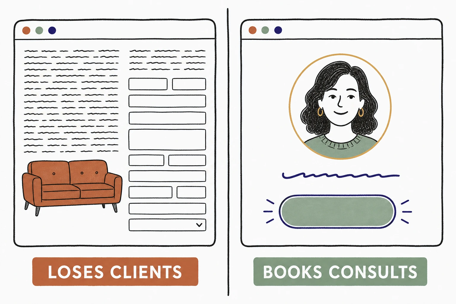
Gets clients versus loses clients, element by element
The same page section is either lowering the barrier or raising it. Here is the line between the two, part by part.
| Element | Loses clients | Gets clients |
|---|---|---|
| Hero image | Stock beach, stacked stones | A warm, current photo of you |
| Headline | "A safe space for healing" | Who you help, with what, where |
| Fees | "Contact me for rates" | Session fee and insurance, stated |
| Bio | A paragraph of initials and modalities | Plain words about who you are and how you work |
| Specialties | Fourteen listed, none believed | Two or three, each with its own page |
| First step | "Start your journey" | "Book a free 15-minute call" |
The same practice, two homepages
See which of the five parts your site is missing.
Send Mirin your site. We grade it against the elements that turn a hesitant visitor into a consult, your photo, your headline, your fees, your first step, and tell you what to fix first.
Run the free scorecard- Paste your site URL
- We grade it in seconds
- You see the gaps
- You decide
What every winning example has in common
Across the therapist homepages we have built at Mirin, the same swap wins every time, and it is never the one the therapist expects.
Practices come to us wanting a longer philosophy page, a richer modality list, a more serene palette. What actually changes the response is blunter. We put the therapist's real portrait at the top, cut the specialty list from a dozen items to the two or three they most want to treat, and state the fee. On the sites we have shipped, those three edits are what turn a quiet page into consult requests. The serene palette never did it once. The face, the sentence, and the fee did.
So the best therapist website example is rarely the most beautiful one in a roundup. It is the one that feels like meeting the therapist a week early.
How to use these examples on your own site
Audit your homepage against the five parts before you touch the design.
Open your site on your phone. Is the first image you, or a beach? Does the headline name who you help? Could a visitor find your fee without emailing you? Does your bio sound like you talking, or a license application? Is the first step small and named? Every "no" is a client who quietly moved to the next tab.
If most of the answers are "no," start with the page that does the deciding: here is what a therapist website has to do before someone books, and how a service page helps a visitor decide faster. And if you are tempted to let an AI builder generate the whole thing in an afternoon, read the problem with AI website builders first, because the hard part of a therapy site is the judgment, not the layout.
Done right, the handled option folds the build and the upkeep into one line, so the five parts stay true as your fee, your openings, and your specialties change. See how that works on Mirin pricing.
See your practice site rebuilt around the five parts.
Send Mirin your current site. We will shape a preview that gets your photo, your headline, your fees, and the first step right, so you can compare the real thing to whatever you have now.
Get my preview- Send your current site
- We shape a preview
- You compare it to your site
- You decide, live in days
The repeatable rule: judge a therapist website example by whether it makes a scared stranger feel safe enough to reach out. Get the five plain parts right and the consults come. Everything else is wrapping paper.


