
At nine on a Tuesday night, someone is on your website deciding whether your shop is worth a trip tomorrow. The site has one job in that moment. Make the next step obvious.
Most shoppers on a specialty retail site are not trying to check out. They want something smaller. Is it in stock. Can I pick it up. Are you open Saturday. Can someone help me choose.
Your website either answers those questions, or your counter does.
This is not an edge case. Seventy six percent of consumers look at a business online before ever visiting in person, and 55 percent of shoppers open a retailer's website before deciding on a store trip. The nine o'clock shopper is your median customer, not your exception.
Curious where your own site stands? Run it through the free Mirin scorecard. Sixty seconds, no signup.
The five paths a shopper is already on
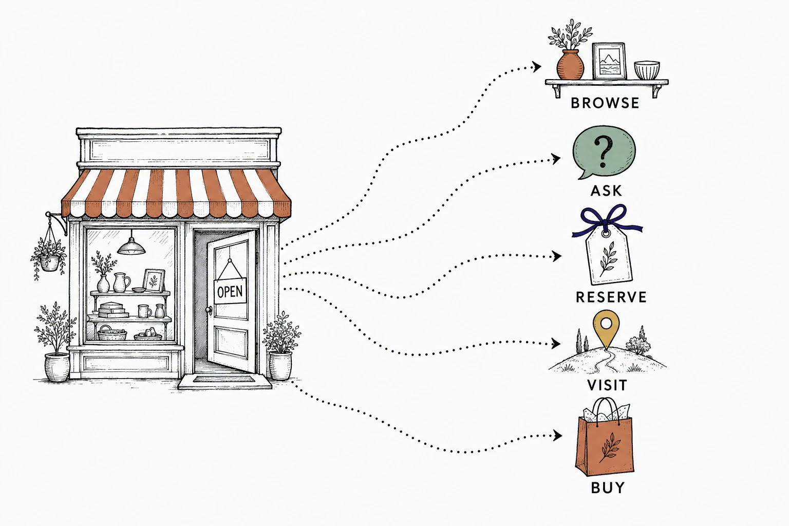
Every visitor is on one of these paths
A boutique, a gift store, a bike shop, an apothecary. Different shelves, same five paths.
The shopper already knows which path they are on. The question is whether your homepage does.
Here is the uncomfortable part. The typical retail homepage tries to serve all five at once. New arrivals, best sellers, hours, shipping notes, staff picks, events, policies, brand story. Everything is on the page, so nothing is first.
The shopper came with one question. The page answered fifteen others.
So they guess. Guessing is friction for them and another email for you. That is the quiet failure. Not a broken page. A full one.
The fix is not more content. The fix is a decision. Which path matters most to your shop this month? Make that one unmissable. Mirin calls this next step clarity, and it is the difference between a website that is a shelf and a website that is a guide.
See the first path your shop should clarify.
Send Mirin your current site. We will shape a preview around the action your shoppers need most, before you pay for anything.
Request a website preview- Send your site
- We shape a preview
- You review it
- You decide
Most website problems are update problems
You already know what your site should say. That was never the problem.
The problem is Tuesday.
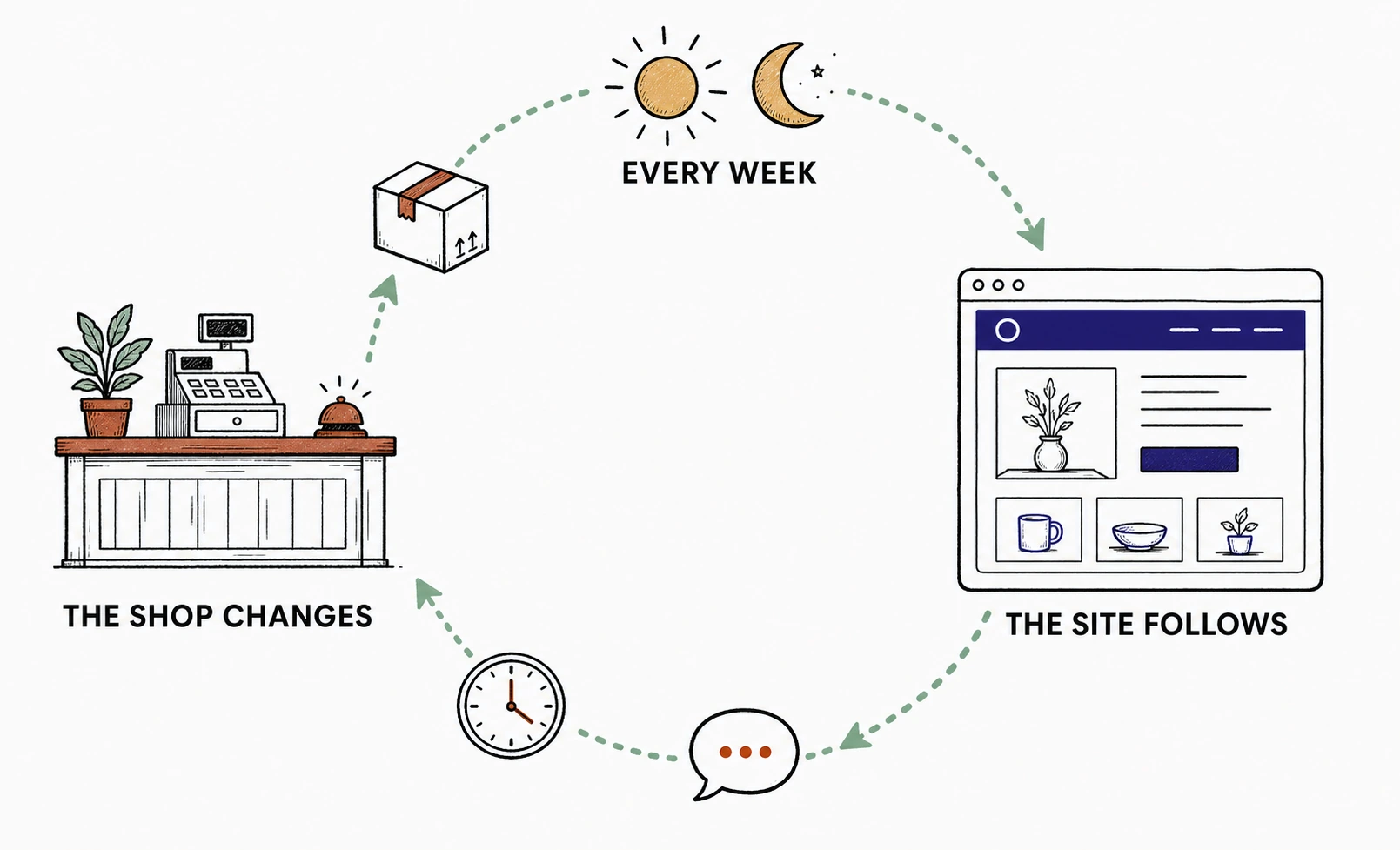
A new line arrives and earns the front table, but the homepage still promotes last month. The pickup note changes, but the footer disagrees. The same sizing question gets asked five times at the counter, and the product page never learns from it.
The public story falls behind the real shop. Quietly. A little more each week.
The weekly update loop
Why does this matter more for specialty retail than anyone else? Because you sell trust. The shopper is not comparing your price against a marketplace. They are asking whether your shop has taste, whether your staff will understand the need, whether the store is worth choosing over the infinite shelf.
A stale site spends that trust. A current one compounds it.
The fix is not publishing more pages. It is an update rhythm the shop can actually keep: one feature that changes monthly, one visit note that is always true, one place a common question gets answered once. Say what changed in plain language, review the preview, approve it, move on. You keep the judgment. Mirin does the publishing.
Put the page in shopper order
Shoppers read a homepage the way they walk into a store. First, is this place for me. Then, what is here right now. Then, what do I do about it.
Most retail homepages are arranged in owner order instead. Whatever mattered internally this quarter sits on top.
Here is the same page, rearranged around the walk.
A homepage in shopper order
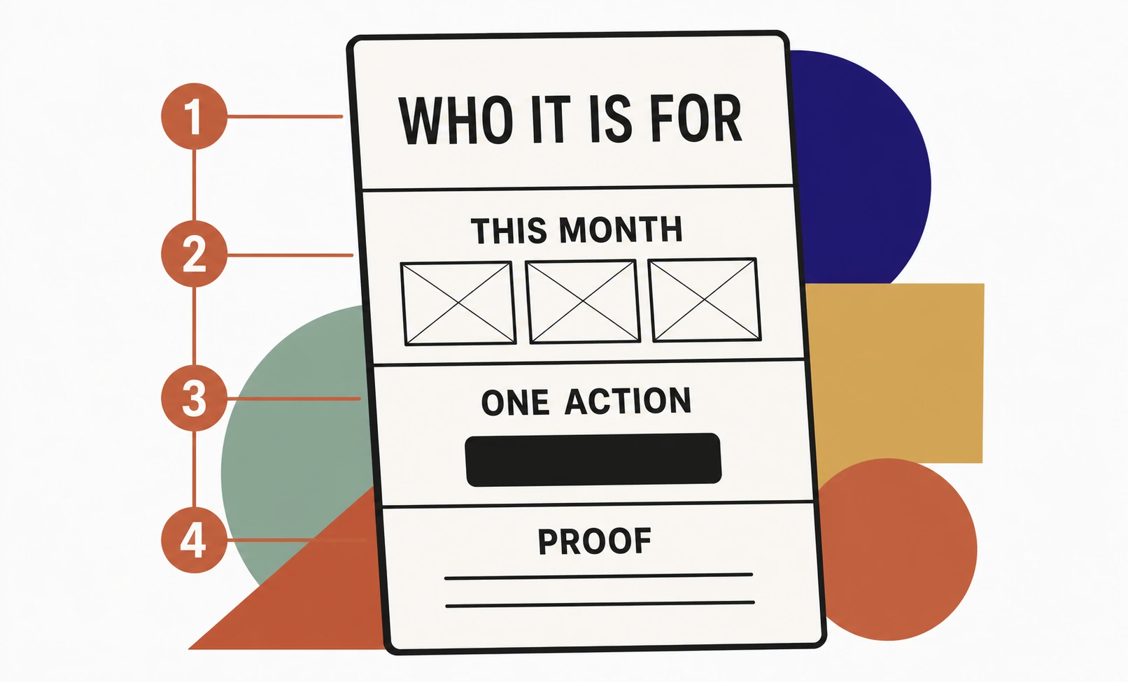
Notice the restraint. Not every category. Not every item. Not a funnel for every product. One line about who the shop is for. One current collection. One obvious action, with just enough proof to make it feel safe.
A shop can feel rich without making the visitor read everything. That is what taste looks like on a homepage.
Promise only what you can keep
Every website promise is a chore assigned to somebody.
If the site says pickup is available, someone keeps that true. If it says ask us about sizing, someone answers well. If it promotes a collection, someone takes it down when it sells through.
This is the honest reason many retail owners hesitate to improve the site. They are not lazy. They are doing the math.
Two promises, one week later
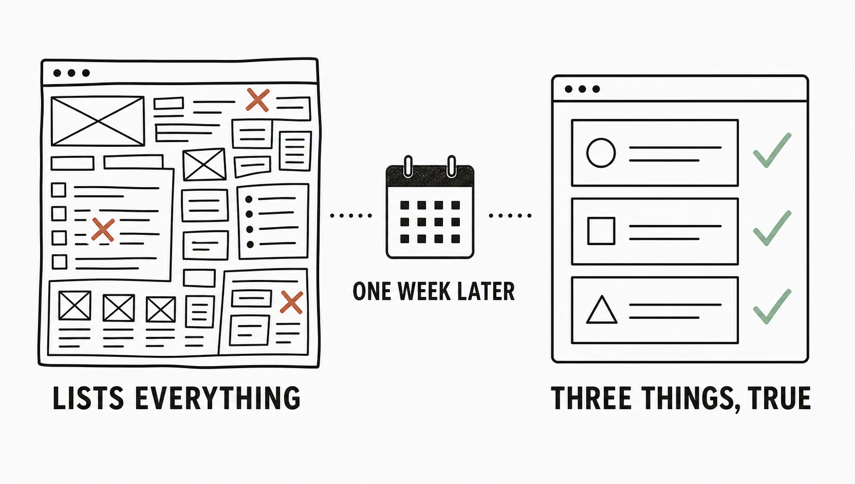
So do the math on purpose. Design the page around your real operating capacity. A boutique invites questions instead of listing every variant. A food market shows current pickup choices, not a catalog. A bike shop makes service questions easy before it pushes a cart.
And be suspicious of anyone whose answer is another dashboard. A dashboard gives you control, which is another word for responsibility. The better trade for most owners is a handled loop: tell Mirin what changed, review the preview, approve. The site stays useful. You stay a shopkeeper.
Audit it in five minutes
Open your site the way a customer does. One real question, very little patience.
Not the admin view. Not design taste. Just the question you answered at the counter today, pointed at your own homepage.
The five minute shopper audit
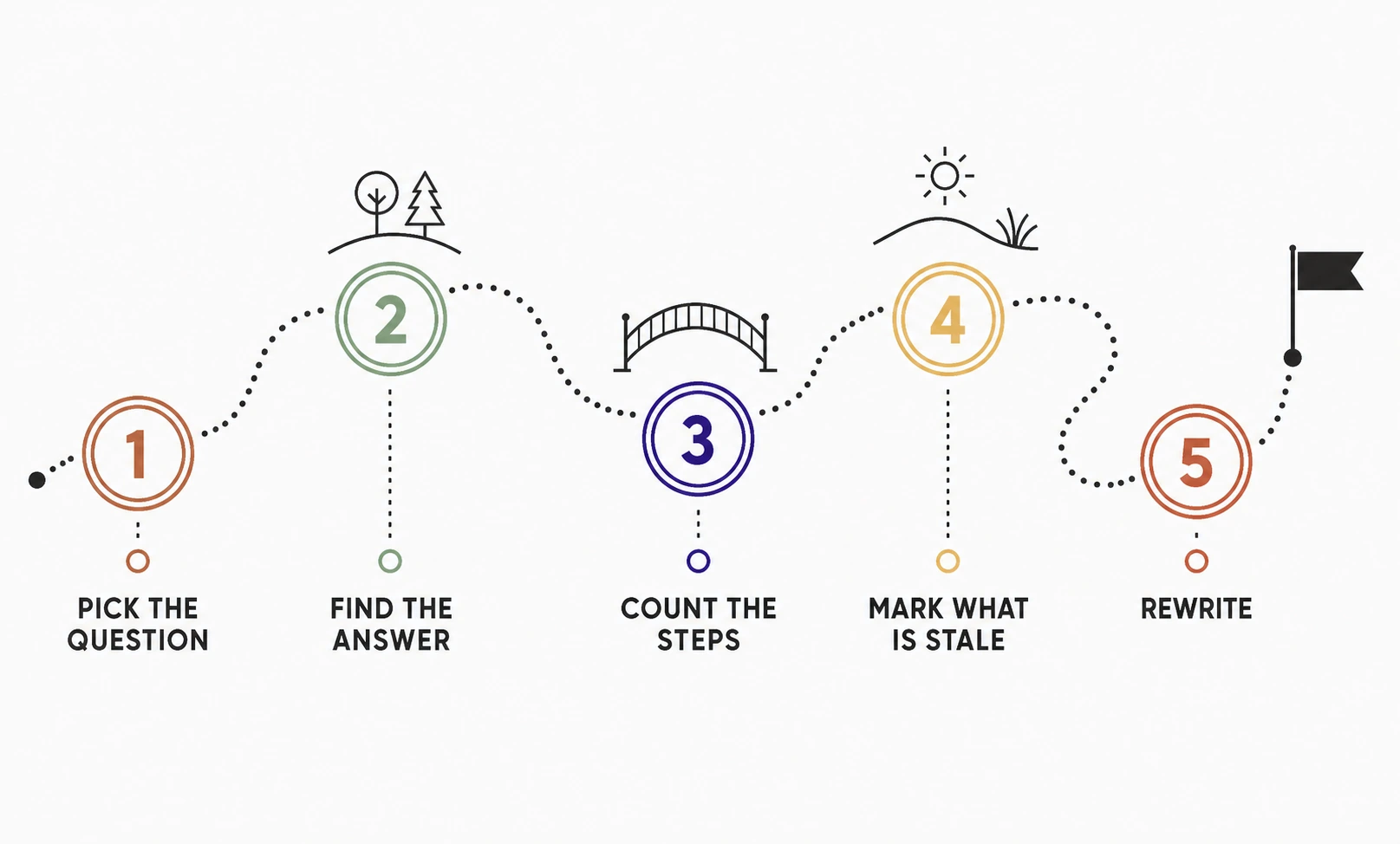
This audit is small on purpose. Specialty retail does not need more vague advice. It needs a shorter path from interest to action, and the page that makes one real decision easier will beat a bigger site that creates five new chores.
If you want to see how the broader handled model works, start with the Mirin platform page. If budget is the next question, Mirin pricing is public. And the Mirin Journal keeps field lessons like this one together, because the next step depends on where you are: some owners are ready to ask for a preview, some are still deciding whether the current site is worth improving at all.
Where Mirin fits
Mirin is built on a simple split. You keep the decisions. We operate the website.
You bring the context no template can guess: what shoppers ask, what is current, what promises are safe, which action matters most. Mirin turns that into a preview you can react to, a page structure in shopper order, and a publishing path that never becomes your second job.
The work is not decoration. It is judgment. Which action belongs above the fold. Which old promise comes down. Which question becomes a guide. Get those right and the website stops being a shelf you restock by hand.
Turn one shopper question into a clearer page.
Send your current site and the question you hear most at the counter. We will shape a preview around the next step that matters.
Get my preview- Your counter question
- A preview shaped around it
- Review, ask for changes
- Live in days
The repeatable rule: if the shopper cannot see the next step, the owner ends up explaining it later. Make the path visible before the question becomes one more counter conversation during busy store hours.