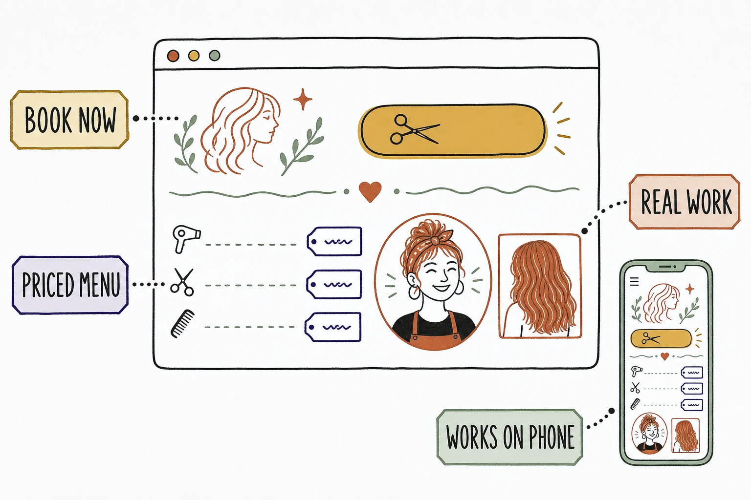
The salon website examples that actually book clients all do four plain things: they put an online booking button on the first screen, they state their services and prices on the page, they show real work by named stylists, and they load fast and clean on a phone. The palette and the hero photo are just wrapping paper. Those four parts are the booking.
Most "best salon website" roundups show you moody hero shots and gold script fonts and never explain why one books a full chair while a prettier one sits quiet.
So this is the annotated version. Not a gallery of pretty homepages. A breakdown of the parts that make someone stop scrolling salons in their neighborhood and book with you tonight.
Want to see how your current site scores on these exact parts? Run it through the free Mirin scorecard. Sixty seconds, no signup.
Anatomy of a salon homepage that books
What makes a salon website example actually book clients
A salon website books clients when someone can tell, in under a minute on their phone, what a service costs, whose work they are trusting, and how to grab a time, without calling during business hours to find out.
That is the whole test. Nobody books the first salon they find. They open a few tabs, or a few Instagram links, and look for the same answers in each one. The site that answers first, and lets them book right there, wins the chair. Stanford's web credibility research found that people judge a site's trustworthiness largely from its design and presentation, and they do it fast. That judgment is not really about how luxe the page looks. It is about whether the page answers questions or dodges them.
So judge every example by the feeling it creates in someone deciding tonight, not by the mood board. The elements below are the ones that decide it. Steal them.
The elements every booking salon website has
Four parts show up in every salon website example that turns a browsing stranger into a booked appointment.
Online booking on the first screen
Put a "Book now" button where a thumb can reach it, and let it show real times. Not a phone number that only answers between ten and six.
Most people deciding on a salon are doing it after work, on the couch, on a phone. If the only way to book is to call tomorrow, half of them will book with the salon down the street that let them grab a Thursday slot right then. The chair is a perishable good. An empty Thursday at 3pm never comes back, and a booking button that works at 9pm is the difference between filling it and not.
A service menu that states prices
List your services and what they cost, or at least a starting price and a range. On the page, not "prices vary, please inquire."
Price is the number one unasked question in beauty, and hiding it does not make it go away. It moves the person to the next salon, where they assume your unlisted balayage is the most expensive of the three. The stakes are real, because this is a crowded local trade. The U.S. Bureau of Labor Statistics counts roughly 700,000 barbers, hairstylists, and cosmetologists working in the country. In a market that dense, the site that names a number reads as the honest one.
A stylist portfolio, not a stock gallery
Real work by a named stylist
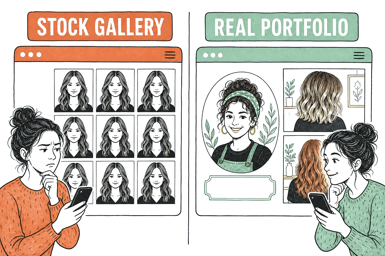
Show photos of hair your salon actually did, credited to the stylist who did it. Not a stock stretch of flawless blonde that any salon on the block could have pasted in.
The portfolio is the most persuasive thing on a salon site, because hair is personal and someone is trusting you with how they will look for a month. "Balayage by Maya, four years specializing in lived-in color" earns more than an anonymous wall of perfect stock hair. Shoppers already lean hard on reviews, as BrightLocal's consumer review research shows year after year, but reviews tell them the salon is good in general. Your own portfolio tells them this specific stylist can do the exact thing they want, which is the question they are actually asking.
A page that works on a phone
The site has to load fast and read clean on a small screen, because that is where almost all of this happens. A desktop-first layout that pinches down to unreadable is a booking you never see.
Someone deciding between salons will book with whichever one makes the next step easiest, and most of that deciding happens on a phone at night. Google's benchmarks found 53% of mobile visitors abandon a page that takes more than three seconds to load, so a booking button that is slow, tiny, or buried below a giant hero video is a booking that quietly went elsewhere.
Books versus loses, element by element
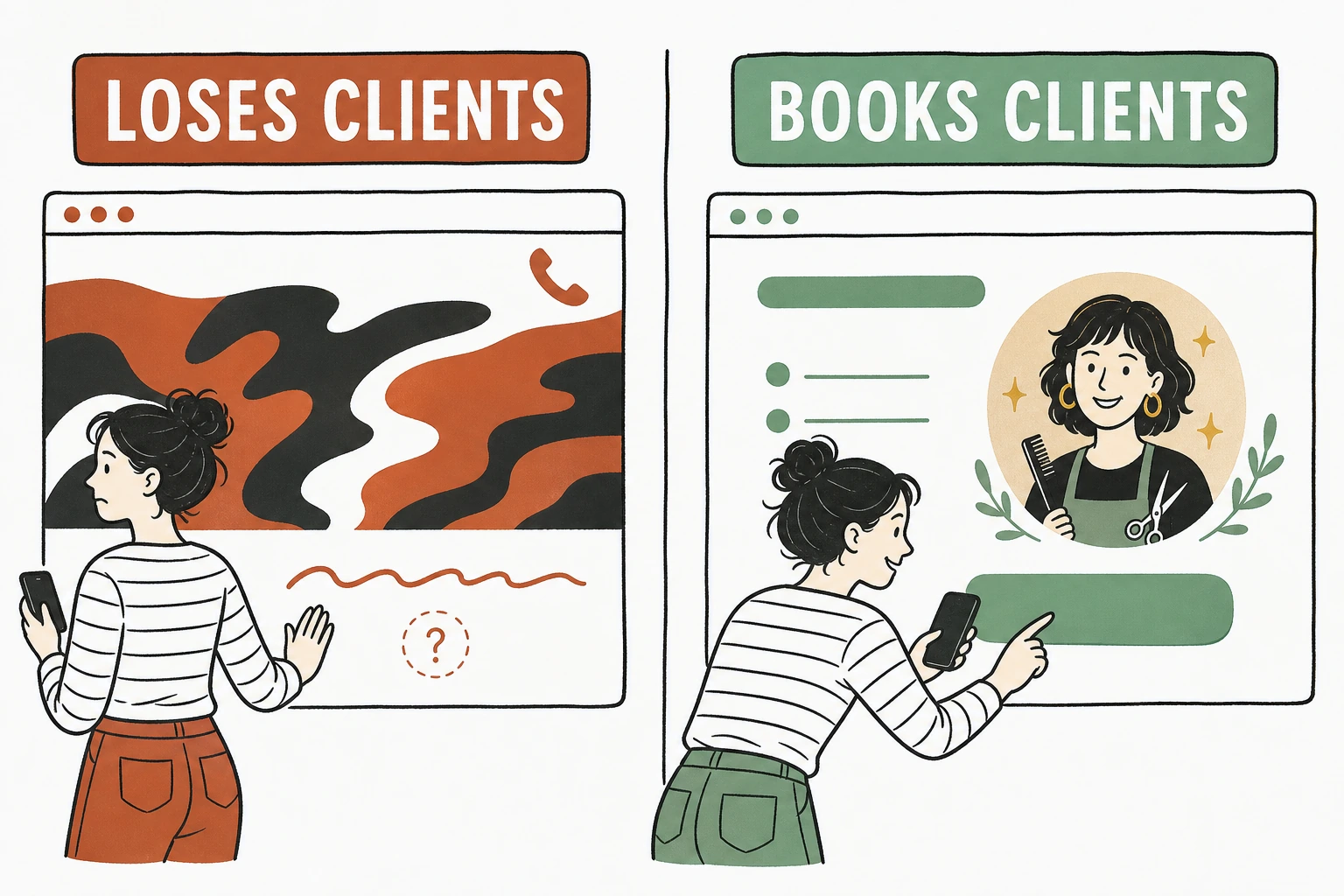
The same part of the page is either lowering the barrier to booking or raising it. Here is the line between the two, part by part.
| Element | Loses the booking | Books the appointment |
|---|---|---|
| Booking | A phone number, calls only | One "Book now" button with real times |
| Pricing | "Prices vary, please inquire" | Services and prices, on the page |
| Portfolio | A wall of stock perfect hair | Real work, the stylist named |
| Headline | "Where beauty comes alive" | What you do and where you are |
| Menu | Fifty services, none priced | Core services, each with a price |
| Mobile | Desktop layout pinched down | Fast, thumb-friendly on a phone |
The same salon, two homepages
See which of the four parts your salon site is missing.
Send Mirin your site. We grade it against the parts that turn a late-night scroller into a booked appointment, your booking button, your prices, your portfolio, your mobile experience, and tell you what to fix first.
Run the free scorecard- Paste your site URL
- We grade it in seconds
- You see the gaps
- You decide
What every booking salon example has in common
Across the salon and stylist homepages we have built at Mirin this year, the same swap books the chair every time, and it is never the one the owner expects.
Owners come to us wanting a bigger hero video, a longer service list, a moodier gold palette. What actually moves bookings is blunter. We put a "Book now" button on the first screen, price the core services right on the page, and put the salon's own portfolio beside the stylist's name. On the sites we have shipped, those three edits are what turn a quiet page into booked appointments. The cinematic hero never did it once. The booking button, the prices, and the real work did.
Donald Miller puts the underlying rule bluntly in Building a StoryBrand: "If you confuse, you'll lose." Someone comparing salons at 9pm is looking for a reason to stop and book, and clarity is that reason. A page that makes them wait until morning to call has already lost to the one that let them grab a time on the spot.
So the best salon website example is rarely the most beautiful one in a roundup. It is the one that answers the questions and takes the booking before the person clicks away.
How to use these examples on your own site
Audit your homepage against the four parts before you touch the design.
Open your site on your phone tonight, the way a client would. Can you book a time without calling? Can you find the price of a cut or color without emailing? Is the work on the page yours, with the stylist named? Does it all load fast and read clean on the small screen? Every "no" is a booking that quietly went to the salon in the next tab.
If most of the answers are "no," start with the parts that do the deciding. Get the booking button, the prices, and your own portfolio right first. The palette and the fonts can wait, because they were never the reason someone booked or did not.
Done right, the handled option folds the build and the upkeep into one line, so the four parts stay true as your services, your prices, and your stylists change. See how that works on Mirin pricing, or how the handled model runs on the Mirin platform page.
See your salon site rebuilt around the four parts.
Send Mirin your current site. We will shape a preview that gets your booking button, your prices, your portfolio, and your mobile experience right, so you can compare the real thing to whatever you have now.
Get my preview- Send your current site
- We shape a preview
- You compare it to your site
- You decide, live in days
The repeatable rule: judge a salon website example by whether it lets someone book tonight and answers their three questions first, what it costs, whose work it is, and how to grab a time. Get those four plain parts right and the chairs fill. Everything else is wrapping paper.

