
The med spa website examples that actually convert all do four plain things: they state treatment pricing on the page, they show before and after tastefully with real credentials beside it, they make one booking button impossible to miss, and they prove who is holding the needle. Design polish is optional. Those four parts are not.
Most "best med spa website" roundups show you moody gold-on-black homepages and never explain why one books a full schedule while a prettier one sits quiet.
So this is the annotated version. Not a gallery of pretty hero images. A breakdown of the parts that make a comparison shopper stop opening tabs and book with you.
Want to see how your current site scores on these exact parts? Run it through the free Mirin scorecard. Sixty seconds, no signup.
Anatomy of a med spa homepage that books
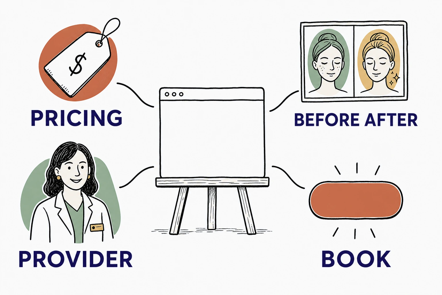
What makes a med spa website example actually convert
A med spa website converts when a comparison shopper can tell, in under a minute, what the treatment costs, who is performing it, and how to book, without emailing you to find out.
That is the whole test. Nobody books the first med spa they find. They open three tabs and look for the same answers in each one, and the site that answers first wins the consult. Stanford's web credibility research found that people judge a site's trustworthiness largely from its design and presentation, and they do it fast. The judgment is not really about how luxe the page looks. It is about whether the page answers questions or dodges them.
So judge every example by the feeling it creates in a shopper mid-comparison, not by the mood board. The elements below are the ones that decide it. Steal them.
The elements every converting med spa website has
Four parts show up in every med spa website example that turns a browsing stranger into a booked consult.
Treatment pricing, stated on the page
Say what a treatment costs, or at least a starting price and a range. On the site, not "call for pricing."
Price is the number one unasked question in aesthetics, and hiding it does not make it go away. It moves the shopper to the next tab, where they assume your unlisted price is the highest of the three. This matters because the money at stake is real: the average medical spa now brings in $1,398,833 a year, and the industry grew from 8,899 locations in 2022 to 10,488 in 2023, according to the American Med Spa Association's State of the Industry report. In a market that crowded, the site that names a number reads as the honest one.
Before and after, done tastefully
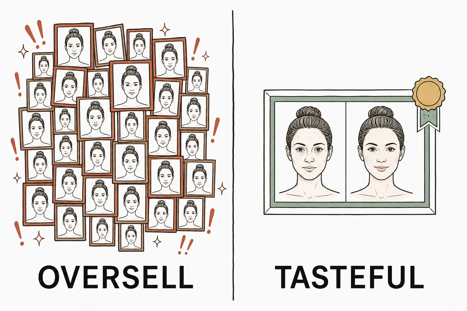
Before and after that proves without overpromising
Show real results, credited to a real provider, with the treatment named. Not a stock stretch of flawless skin, and not a dramatic wall that promises everyone the same outcome.
Before and after photos are the most persuasive thing on an aesthetics site and the fastest way to lose trust when they feel staged or overclaimed. The honest version shows a believable result, says which treatment produced it, and lets the shopper picture themselves in it. The overpromising version triggers the exact skepticism you are trying to overcome. Tasteful proof is a trust signal. A miracle wall is a warning sign.
Provider credentials a shopper can trust
Name who performs the treatments and what they are qualified to do. "Injections administered by our nurse injector, Sarah, RN, with eight years in aesthetics" earns more than an anonymous "our expert team."
Here is the wrinkle that makes med spas different from most local businesses. Shoppers lean hard on reviews, as BrightLocal's consumer review research shows year after year, but a needle near the face raises a second, sharper question that reviews alone do not answer: is the person doing this actually qualified. The site has to answer it plainly, because a five-star average does not tell a nervous first-timer who is holding the syringe.
One booking step that is impossible to miss
The call to action should be one obvious button that says what happens next. "Book a consult" works. A phone number buried in the footer does not, and neither does a contact form that asks for a paragraph before it lets you pick a time.
The shopper deciding between three med spas will book with whichever one makes the next step easiest, and most of that deciding happens on a phone. Google's benchmarks found 53% of mobile visitors abandon a page that takes more than three seconds to load, so a booking button that is slow, tiny, or three taps deep is a booking you never see.
Converts versus loses, element by element
The same section of the page is either lowering the barrier to booking or raising it. Here is the line between the two, part by part.
| Element | Loses the booking | Wins the booking |
|---|---|---|
| Pricing | "Call for pricing" | Starting price and range, on the page |
| Before and after | A dramatic wall of miracle results | One honest pair, treatment and provider named |
| Provider | "Our expert team" | Named injector with real credentials |
| Headline | "Rediscover your glow" | What you treat and where you are |
| Booking | A phone number in the footer | One clear "Book a consult" button |
| Menu | Forty services, none explained | Core treatments, each with a price |
The same med spa, two homepages
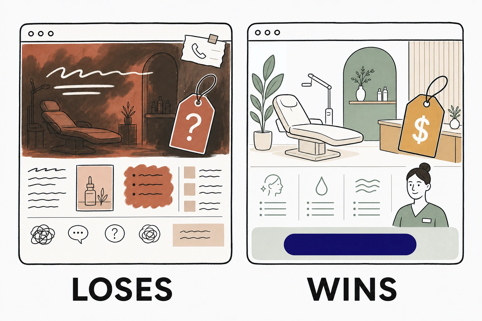
See which of the four parts your med spa site is missing.
Send Mirin your site. We grade it against the parts that turn a comparison shopper into a booked consult, your pricing, your proof, your provider, your booking step, and tell you what to fix first.
Run the free scorecard- Paste your site URL
- We grade it in seconds
- You see the gaps
- You decide
What every converting med spa example has in common
Across the med spa homepages we have built at Mirin this year, the same swap wins every time, and it is never the one the owner expects.
Owners come to us wanting a more cinematic hero video, a longer treatment menu, a moodier palette. What actually moves consult requests is blunter. We put a starting price beside each core treatment, name the injector with her real credentials, and make one booking button the loudest thing on the first screen. On the sites we have shipped, those three edits are what turn a quiet page into booked consults. The cinematic hero never did it once. The price, the name, and the button did.
Donald Miller puts the underlying rule bluntly in Building a StoryBrand: "If you confuse, you'll lose." A shopper comparing three med spas is looking for a reason to stop, and clarity is that reason. The industry itself is not slowing down to make it easy: "After robust growth and rebound after the pandemic, the industry continues to thrive and shows no signs of stopping anytime soon," said Alex Thiersch, AmSpa's founder and CEO, in the report announcement. More competitors every year means the clearest site, not the prettiest, is the one that gets the booking.
So the best med spa website example is rarely the most beautiful one in a roundup. It is the one that answers a shopper's three questions before they think to ask.
How to use these examples on your own site
Audit your homepage against the four parts before you touch the design.
Open your site on your phone. Can a shopper find a price without calling? Is your before and after honest and credited, or a miracle wall? Is your injector named with real credentials? Is there one obvious booking button on the first screen? Every "no" is a booking that quietly went to the med spa in the next tab.
If most of the answers are "no," start with the parts that do the deciding. Here is how a med spa website builds confidence without overpromising, and if you are still collecting quotes, what a med spa website should actually cost so you know what you are paying for.
Done right, the handled option folds the build and the upkeep into one line, so the four parts stay true as your menu, your prices, and your injectors change. See how that works on Mirin pricing, or how the handled model runs on the Mirin platform page.
See your med spa site rebuilt around the four parts.
Send Mirin your current site. We will shape a preview that gets your pricing, your proof, your provider, and the booking step right, so you can compare the real thing to whatever you have now.
Get my preview- Send your current site
- We shape a preview
- You compare it to your site
- You decide, live in days
The repeatable rule: judge a med spa website example by whether it answers a comparison shopper's three questions, what it costs, who performs it, and how to book. Get those four plain parts right and the consults come. Everything else is wrapping paper.


