
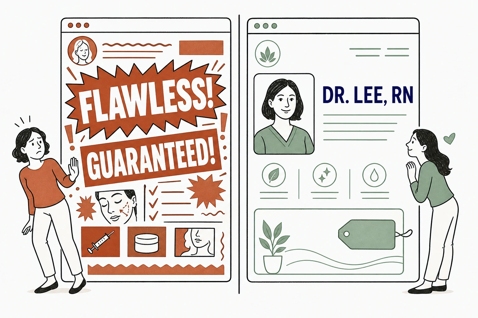
A med spa website builds trust by being specific and honest, not by promising results it cannot guarantee. Name the provider and their license. State what a treatment does and what it costs. Show real faces and real rooms. The moment a page shouts "flawless," "guaranteed," or "erase ten years," a cautious buyer stops believing the rest of it.
That is the whole answer. Trust is not a slogan you add. It is a claim you can back, written plainly enough that a nervous first timer relaxes.
The paradox of aesthetics marketing is that the louder the promise, the smaller the trust. People booking injectables or lasers are handing you their face. They read your site the way they read a consent form.
Not sure what your current site says to that person. Run it through the free Mirin scorecard. Sixty seconds, no signup.
Two med spa homepages, two different promises
What building confidence without overpromising means
It means every claim on the page is one you could defend to a regulator, a patient, and your own conscience.
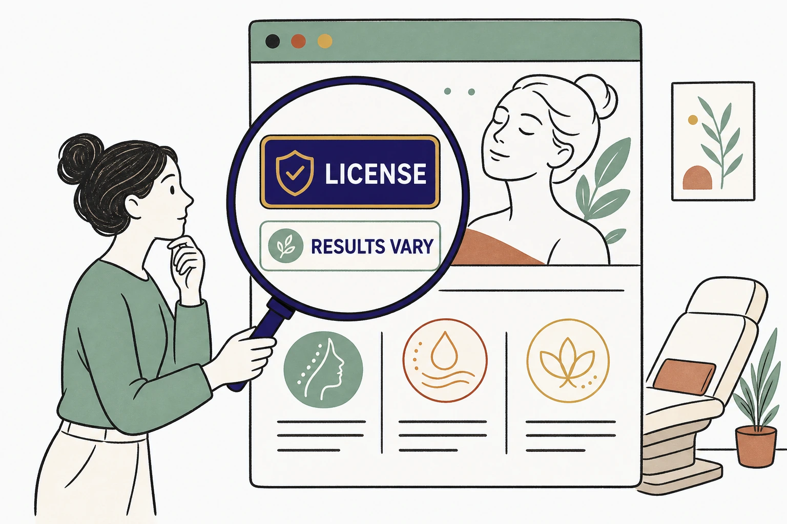
Overpromising is the easy trap. Aesthetic results vary by person, by skin, by how many sessions someone actually books. A homepage that guarantees a fixed outcome is writing a check the treatment room cannot always cash. The confident version does the opposite. It describes the treatment accurately, sets a realistic range, and lets the provider's credentials carry the weight the adjectives used to.
This is not softer marketing. It is stronger marketing, because it survives contact with a skeptic. Confidence reads as calm specificity. Desperation reads as exclamation points.
Why patients scrutinize med spa claims harder than most
A med spa visitor is more careful than almost any other local buyer, because the purchase is medical, personal, and irreversible.
They are not choosing a restaurant. They are choosing who injects a neurotoxin near their eyes. So they check, and they check more than once. In BrightLocal's 2024 survey, 75 percent of consumers always or regularly read online reviews before choosing a local business, and 41 percent consult three or more sites before deciding. Your homepage is one tab in a careful comparison, not the only one open.
The med spa visitor reads your site like a consent form
And the way your site looks is part of that inspection. In the Stanford Web Credibility Project, based on three years of research with more than 4,500 people, 46.1 percent of people judged a site's credibility in part on visual design, its layout, typography, and color. "People do judge a Web site by how it looks," said B.J. Fogg, the Stanford psychologist who directed the research. A cluttered, dated med spa page loses trust before a single word is read.
What the FTC and FDA expect from your claims
Federal rules already draw the line between confidence and overpromising, and they favor the honest page.
The FTC's Health Products Compliance Guidance requires that health and treatment claims be backed by "competent and reliable scientific evidence." It also warns that "results not typical" disclaimers are likely deceptive and cannot rescue an exaggerated promise. In plain terms, a med spa cannot post a dramatic before and after and quietly caption it as atypical. The page has to disclose the results a real customer can actually expect.
Devices raise the bar again. If your marketing describes a laser or an injectable, the claim has to match the FDA cleared intended use of that product. Off label enthusiasm on a homepage is a compliance risk, not a selling point. The reassuring truth is that the compliant page and the trustworthy page are the same page. Being honest about outcomes is not a legal tax on your marketing. It is the marketing.
See where your site oversells and where it undersells your trust.
Send Mirin your med spa site. We grade the things that build confidence, provider credibility, honest claims, real photos, the booking step, and tell you what to fix first.
Run the free scorecard- Paste your site URL
- We grade it in seconds
- You see the gaps
- You decide
What actually builds trust on a med spa homepage
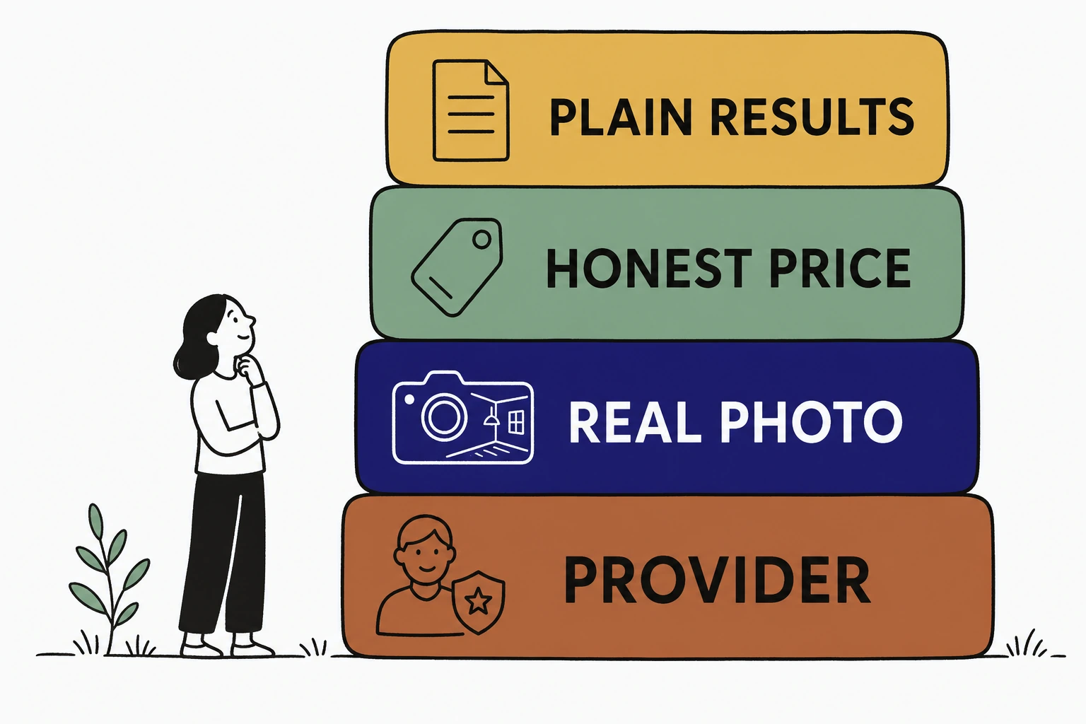
Trust is built by four things a skeptic can verify, not by adjectives she cannot.
Name the provider and show the license. A real photo of the injector, her credentials, and her years of experience do more than any "world class" banner. State the treatment plainly and price it honestly, because a hidden price reads as the highest price. Use real photos of your real room and your real staff, not stock models. And write outcomes in the language a careful person trusts, "most clients see softening over two to three sessions," not "erase every line."
What a nervous first timer needs to see
Across the med spa homepages we have built at Mirin this year, the single change that lowered bounce was not a glossier before and after gallery. It was pairing the injector's name and license with one plain sentence that results vary by person. The nervous first timer relaxed at exactly the line most sites are afraid to write. Honesty read as competence.
The context helps. The average medical spa now earns $1,398,833 a year, according to the American Med Spa Association, which means the visitor knows she is a valuable customer and expects to be treated like an informed adult, not a mark for a hard sell.
The lines to cut and the lines to keep
Cut every superlative you cannot prove. Keep every specific you can.
"Flawless results," "guaranteed," "the best in the city," and "look 20 years younger" are the lines that quietly cost you the careful buyer. They are unprovable, they invite comparison, and under FTC guidance they can be deceptive. Replace them with the specifics that actually reassure. Who performs the treatment. How many sessions it usually takes. What it costs. What a realistic result looks like. The specific line is both more honest and more persuasive, because the reader can picture herself in it.
This is the same discipline that decides a med spa website's real value. A page that earns trust before it sells is the one that fills a schedule, and the way you get there overlaps almost exactly with what a med spa website should cost to run. If you are weighing that too, here is how much a med spa website costs in 2026 and what you actually get at each price.
How to make your site trustworthy without a rewrite
Most of these fixes cost nothing but a decision, and you should not have to make them alone between patients.
For $199 a month, Mirin builds the site, hosts it, and makes the changes for you, with the honest, specific, compliance aware copy that earns a cautious buyer's trust. You tell Mirin in plain language what changed, a new injector, a new treatment, a new price, and Mirin makes the edit, shows you a preview, and publishes it. No request queue, no invoice per change. See the full breakdown on Mirin pricing, or how the handled model works on the Mirin platform page.
The point is not to say less about your med spa. It is to say the true things clearly, so the person handing you her face can believe them.
See your med spa site rebuilt to earn trust before it sells.
Send Mirin your current site. We will shape a preview around the things a cautious buyer checks, the provider, the room, honest pricing, and plain language about results, so you can see the trustworthy version before you pay.
Get my preview- Send your current site
- We shape a trustworthy preview
- You review the honest copy
- You decide, live in days
The repeatable rule: say the true things clearly. A med spa website that builds confidence without overpromising is not the quiet one. It is the specific one, and specificity is what a careful buyer trusts.


