A service page converts when it names the one problem the visitor came to solve, says plainly what you do and what it costs, proves it with real work and real words from real clients, and puts one obvious next step in front of them at every scroll. That is the whole page. Everything else is decoration that gets in the way.
Here is the shortest version. The visitor is not reading. She is scanning for a reason to trust you and a way to act. Give her both, fast, and get out of the way.
The problem with most service pages is that they were written for the business, not the buyer. They open with a mission statement and a photo of a building. But the buyer arrived with a specific problem and a specific question: can these people fix this, and what will it take. A page that answers that in the first screen converts. A page that makes her hunt for it does not.
Not sure what your current service page tells a visitor to do. Run it through the free Mirin scorecard. Sixty seconds, no signup.
The brochure page versus the service page

What a service page actually is
A service page is the page where a stranger decides whether to hire you, so its only job is to move her from wanting the outcome to asking for it.
It is not your homepage and it is not your story. It is a single, focused answer to a single service the visitor is shopping for. She typed a problem into a search box, clicked your link, and now she is deciding in seconds. The page has to name her problem back to her, show she is in the right place, and make the next step impossible to miss.
You do not have long to do it. Nielsen Norman Group's analysis of user behavior found that users often leave web pages in 10 to 20 seconds, and pages must communicate their value proposition within that window to earn a longer visit. The first screen is not the introduction. It is the whole audition.
Why most service pages quietly lose the visitor
Most service pages lose the buyer by making her work to find the one thing she came for.
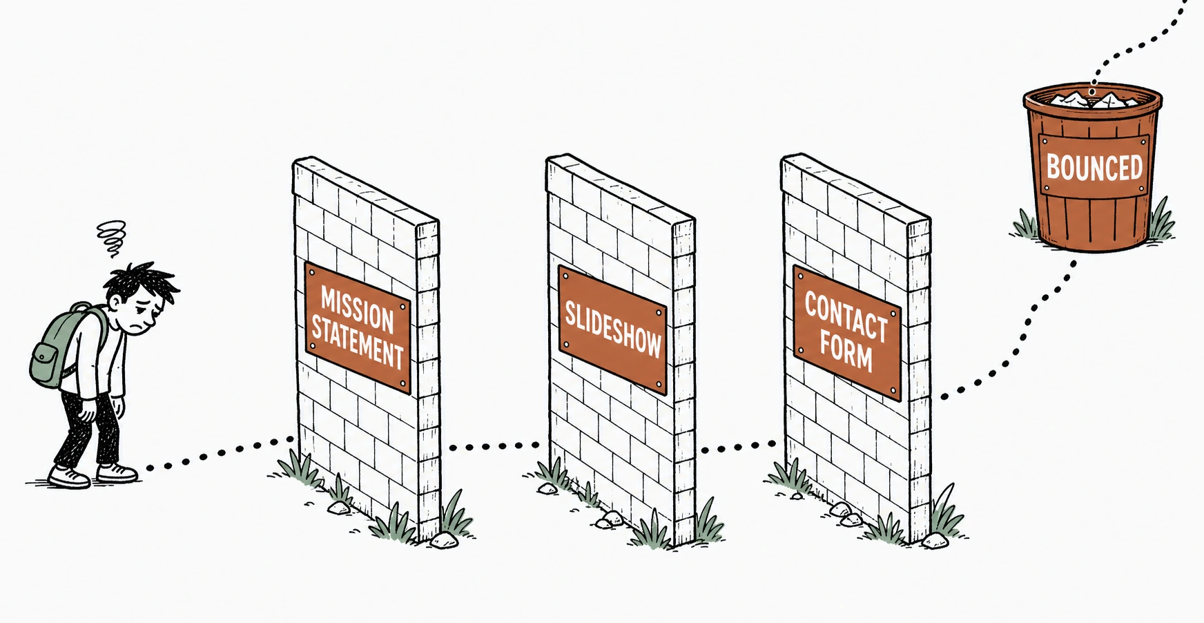
Think about what she is doing. She is on her phone, comparing three tabs, and every tab is a business that says it is passionate, trusted, and dedicated. Those words are noise because everyone uses them. What she wants is the specific: what exactly you do, whether you have done it for someone like her, what it costs, and how to start. When those answers are buried under a slideshow and a mission statement, she does not dig. She closes the tab.
Where the visitor gives up
Placement matters as much as words. Nielsen Norman Group's eyetracking research found that people spend 57 percent of their page-viewing time above the fold, and attention drops sharply the further down the page content sits. If your offer and your button are below the fold, most visitors never see them.
And she judges the page before she reads it. In the Stanford Web Credibility Project, based on three years of research with more than 4,500 people, 46.1 percent of people judged a site's credibility in part on its visual design, the layout, typography, and color. "People do judge a website by how it looks," said B.J. Fogg, the Stanford psychologist who directed the research. A cluttered service page is not a neutral first impression. It is evidence about how you work.
See exactly where a buyer would give up on your service page.
Send Mirin your page. We grade the things that decide a hire, a clear offer, an obvious next step, real proof, and honest pricing, and tell you what to fix first.
Run the free scorecard- Paste your page URL
- We grade it in seconds
- You see the gaps
- You decide
What a service page that converts actually does
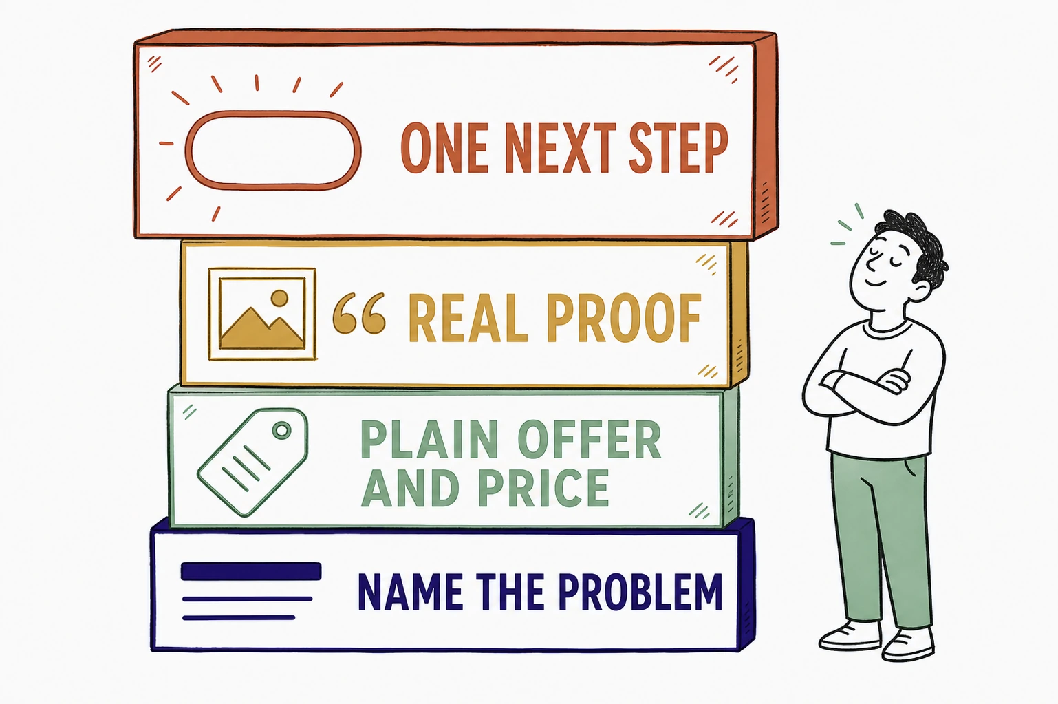
It does four plain things the buyer can use on the first screen, not four things a copywriter admires.
Name the problem in her words, at the top, so she knows she is in the right place. State the offer and the price plainly, because a hidden price reads as the highest price and sends the careful buyer to the competitor who told her. Prove it with real photos of real work and a real quote from a real client, not stock images and the word trusted. And put one next step, the same next step, in front of her at every scroll, so acting never requires hunting. One page, one problem, one price, one button.
What a converting service page is built from
Across the service-business pages we have built at Mirin, the change that moved inquiries most was not more copy or a bigger gallery. It was cutting the page down to one clear offer and repeating a single next step down the whole scroll. The pages that named a price and asked for one action beat the polished pages that offered five. The buyer who used to leave to compare stopped comparing and started asking.
The parts to cut and the parts to keep
Cut everything that delays the answer. Keep everything that helps her decide she is in the right place and can act now.
Cut the autoplay hero video, the mission statement, the history of the company, the wall of adjectives, the contact form that stands in for a real next step, and the second and third calls to action that split her attention. Keep the headline that names her problem, the plain description of the service, the price or the honest starting price, one real testimonial with a name, real photos of the work, and one obvious button repeated as she scrolls. A converting service page is not the one with the most sections. It is the one that removed the most distance between the problem and the next step.
How to write a service page that converts without a rebuild
Most of these fixes are a decision, not a project, and you should not have to make them between jobs.
For $199 a month, Mirin builds the page, hosts it, and makes the changes for you, with the problem named up top, a plain offer and price, real proof, and one obvious next step. You tell Mirin in plain language what changed, a new service, a new price, a new photo, a new testimonial, and Mirin makes the edit, shows you a preview, and publishes it. No request queue, no invoice per change. See the full breakdown on Mirin pricing, or how the handled model works on the Mirin platform page.
See your service page rewritten so a buyer can hire you in one step.
Send Mirin your current page. We will shape a preview around the decision, the named problem, the plain price, real proof, and one clear next step, so you can see the converting version before you pay.
Get my preview- Send your current page
- We shape a decision-first preview
- You review the next step
- You decide, live in days
The repeatable rule: write for the decision. A service page that converts is not the most polished one. It is the one that names the problem, states the price, proves the work, and asks for one thing, in the moment the buyer is ready to say yes.