A restaurant website works on mobile when a hungry person can read the menu, see today's hours, tap to call, and book a table without ever pinching to zoom. That is the whole job. Design for the thumb on the sidewalk, not the desktop in the office. The site that answers the three questions fast is the one that fills the table tonight.
That is the answer. The person deciding where to eat is standing outside, on a phone, hungry, in the next ten minutes. Everything on the page is in service of that moment.
Here is the problem with most restaurant sites. They were built to be admired on a big screen, so the menu is a PDF, the hours are three taps deep, and the phone number is plain text you have to copy. But nobody browses a restaurant on a laptop at dinnertime. They are on the street, thumb ready, and every extra tap costs you the table.
Not sure what your site does on a phone at 7pm on a Friday. Run it through the free Mirin scorecard. Sixty seconds, no signup.
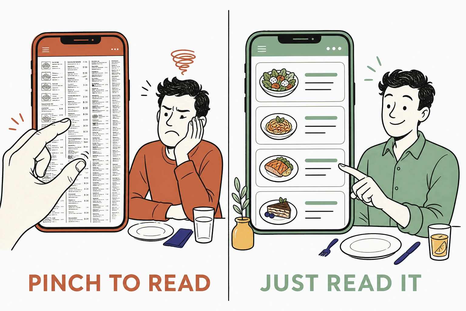
The pinch-to-zoom menu versus the readable one
What mobile-first restaurant website design actually means
It means the person on a phone can read the menu, find the hours, call you, and reserve a table without a single pinch, zoom, or dead end.
Mobile-first is not a shrunken version of the desktop site. It is the real site, and the desktop is the afterthought. The diner sees the menu in plain readable text, sees that you are open, taps the number to call, and taps once more to book. No PDF. No hunting. No form that promises a callback.
The stakes are set before anything loads. According to Think with Google, 53 percent of mobile site visits are abandoned if a page takes longer than three seconds to load. A heavy homepage loses half its diners before they ever see the menu.
Why the PDF menu quietly loses you tables
A menu the diner cannot read on a phone is a menu they will read somewhere else, at the restaurant that made it easy.
The menu is the whole reason someone visits a restaurant website. They are not there for your story or your gallery. They want to know what you serve and what it costs, right now, and a PDF built for print makes them pinch, drag, and squint to find out. The impulse cools with every gesture.
Where the hungry diner goes when the menu won't load
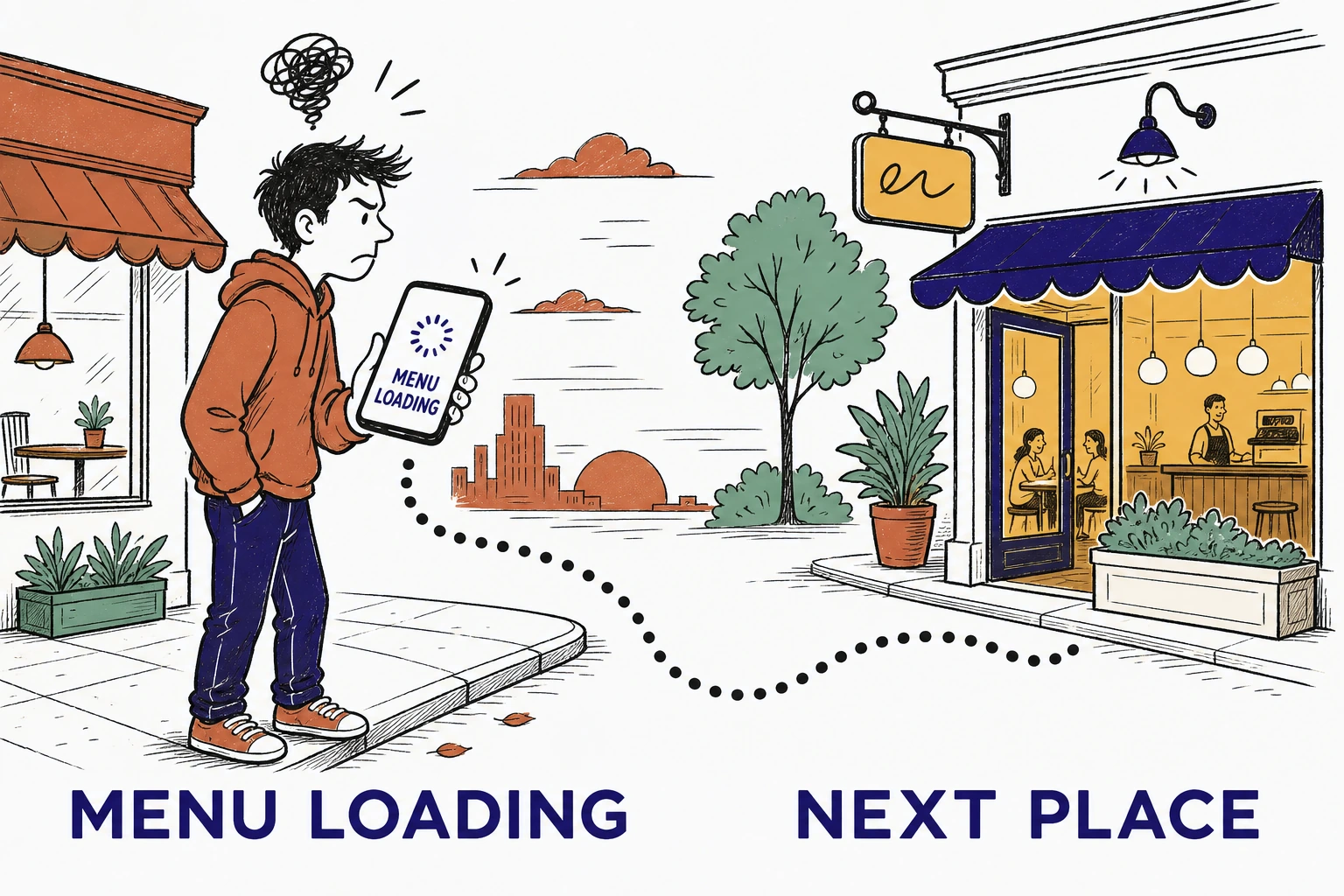
The demand is not subtle. Think with Google reports that 76 percent of people who search for something nearby on their smartphone visit a related business within a day. That is a diner ready to walk in today. A site that hides the menu behind a pinch hands that ready diner to whoever made theirs easy to read.
First impressions carry the same weight. In the Stanford Web Credibility Project, based on three years of research with more than 4,500 people, 46.1 percent of people judged a site's credibility in part on its visual design, the layout, typography, and color. "People do judge a website by how it looks," said B.J. Fogg, the Stanford psychologist who directed the research. For a restaurant, a cramped unreadable homepage reads as a preview of the meal.
Why hours and tap-to-call decide the walk-in
The two questions right behind the menu are simple: are you open, and can I reach you in one tap. Miss either and the walk-in evaporates.
Think about the moment. The diner has settled on your place. Now they need to know you are open tonight, not just your usual hours, and they want to call to ask about a table or a wait. If the hours are buried and the phone number is plain text they have to copy and paste, the friction sends them back to the search results. A tap-to-call link and clearly posted hours are the difference between a reservation and a bounce.
What a mobile restaurant homepage is built from
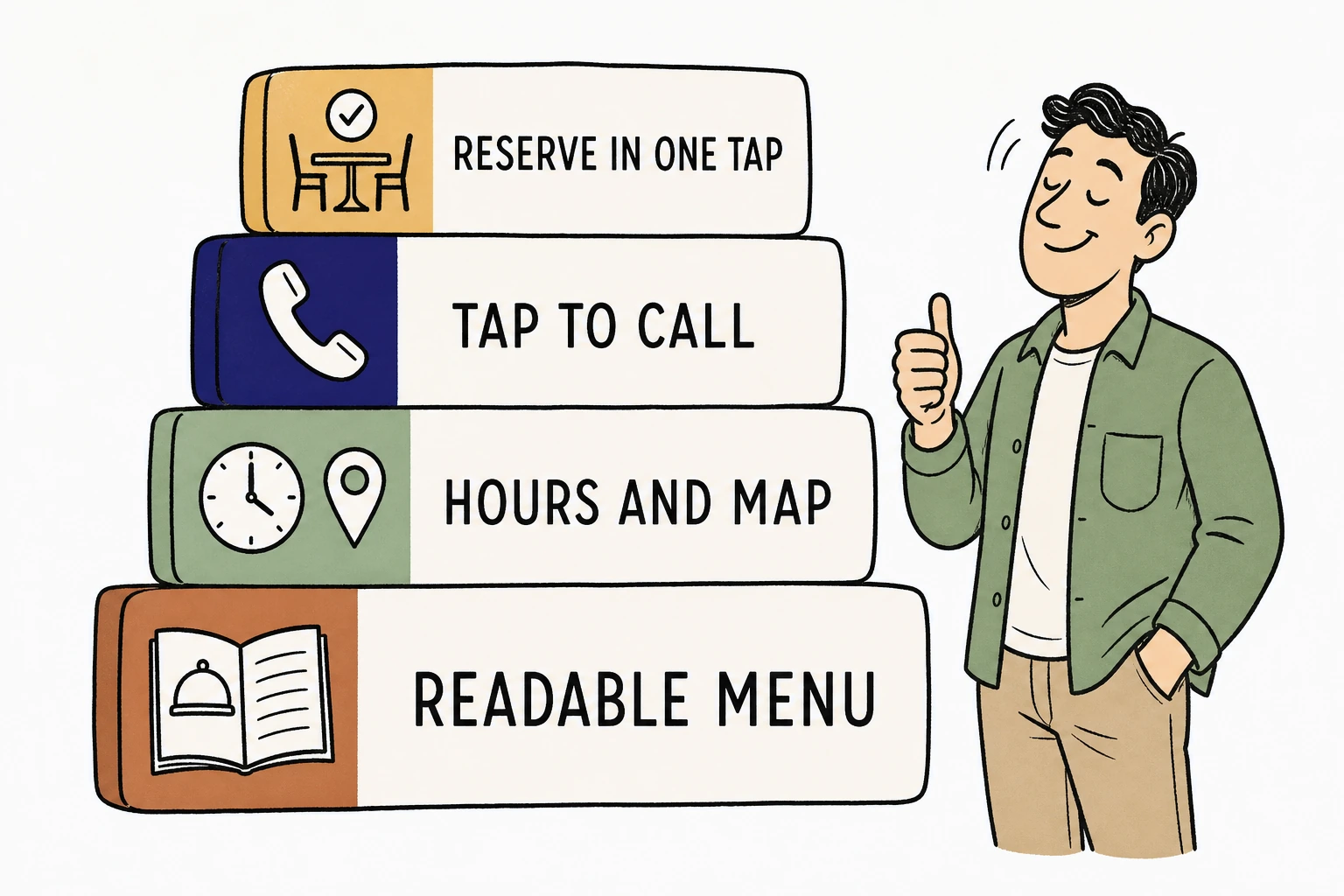
Across the restaurant and local homepages we have built at Mirin, the single change that moved the most action was not a bigger food photo. It was turning the phone number into a real tap-to-call link and pinning the menu and hours to the top of the mobile screen. Diners who used to bounce hunting for a number started calling instead. The decision moved from maybe later to a table tonight.
See exactly where a hungry diner would give up on your phone.
Send Mirin your restaurant site. We grade the things that decide a table, a readable menu, posted hours, tap-to-call, and one-tap reservations, and tell you what to fix first.
Run the free scorecard- Paste your site URL
- We grade it in seconds
- You see the gaps
- You decide
What a mobile restaurant homepage actually needs
It does four plain things a diner can use on the first tap, not four things a designer admires.
Put the menu in real readable text at the top, never a PDF that demands a pinch. Post today's hours and a map so the diner knows you are open and where to go. Make the phone number a tap-to-call link so a question is one thumb away. And put a reserve button that books a table in one tap, not a contact form that promises someone will get back to them. Those four answers, fast, fill the room.
Everything else is decoration. The diner is asking a short list of questions, and the mobile-first site answers them before the impulse cools.
The parts to cut and the parts to keep
Cut everything that slows the phone. Keep everything that answers the one question the diner is asking, can I eat here tonight.
Cut the full-screen intro video that eats a mobile screen and the data plan, the PDF menu, the plain-text phone number, the contact form standing in for reservations, and the stock photos of food you do not serve. Keep the readable menu, the posted hours, the map, the tap-to-call link, the one-tap reserve button, and real photos of your actual dishes and room. A mobile-first restaurant site is not the one with the most features. It is the one that removed the most friction between hungry and seated.
How to make your restaurant site mobile-first without a rebuild
Most of these fixes are a decision, not a project, and you should not have to make them during the dinner rush.
For $199 a month, Mirin builds the site, hosts it, and makes the changes for you, with a readable menu, posted hours, a map, tap-to-call, and one-tap reservations, all shaped for the phone first. You tell Mirin in plain language what changed, a new dish, a holiday closing, a new price, a special, and Mirin makes the edit, shows you a preview, and publishes it. No request queue, no invoice per change. See the full breakdown on Mirin pricing, or how the handled model works on the Mirin platform page.
See your restaurant site rebuilt so a diner can read, call, and book in one tap.
Send Mirin your current site. We will shape a preview around the phone, a readable menu, posted hours, tap-to-call, and one-tap reservations, so you can see the mobile-first version before you pay.
Get my preview- Send your current site
- We shape a mobile-first preview
- You review it on your phone
- You decide, live in days
The repeatable rule: design for the thumb on the sidewalk. A restaurant website that works on mobile is not the flashiest one. It is the one that lets a hungry person read the menu, see the hours, tap to call, and book a table without a single surprise, and that is the moment that fills the room.