
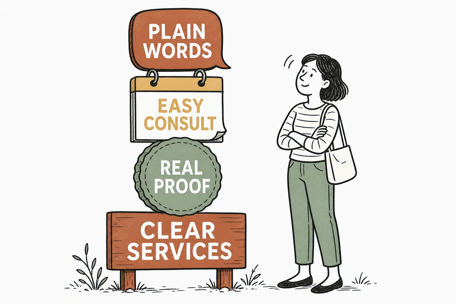
A professional services website works when it makes your expertise easy to buy. Say plainly what you do and what it costs to start, prove you can be trusted, and make booking a consult one obvious step. The firm that lowers the effort of hiring it wins the client.
That is the whole answer. A buyer is not shopping for the most impressive site. They are shopping for the firm that is easiest to say yes to.
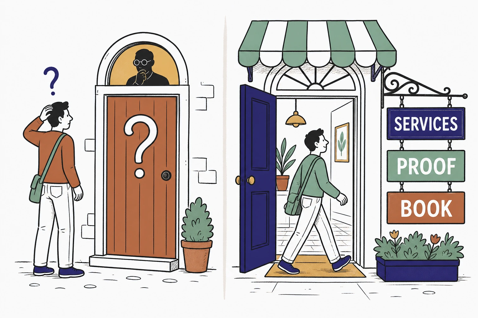
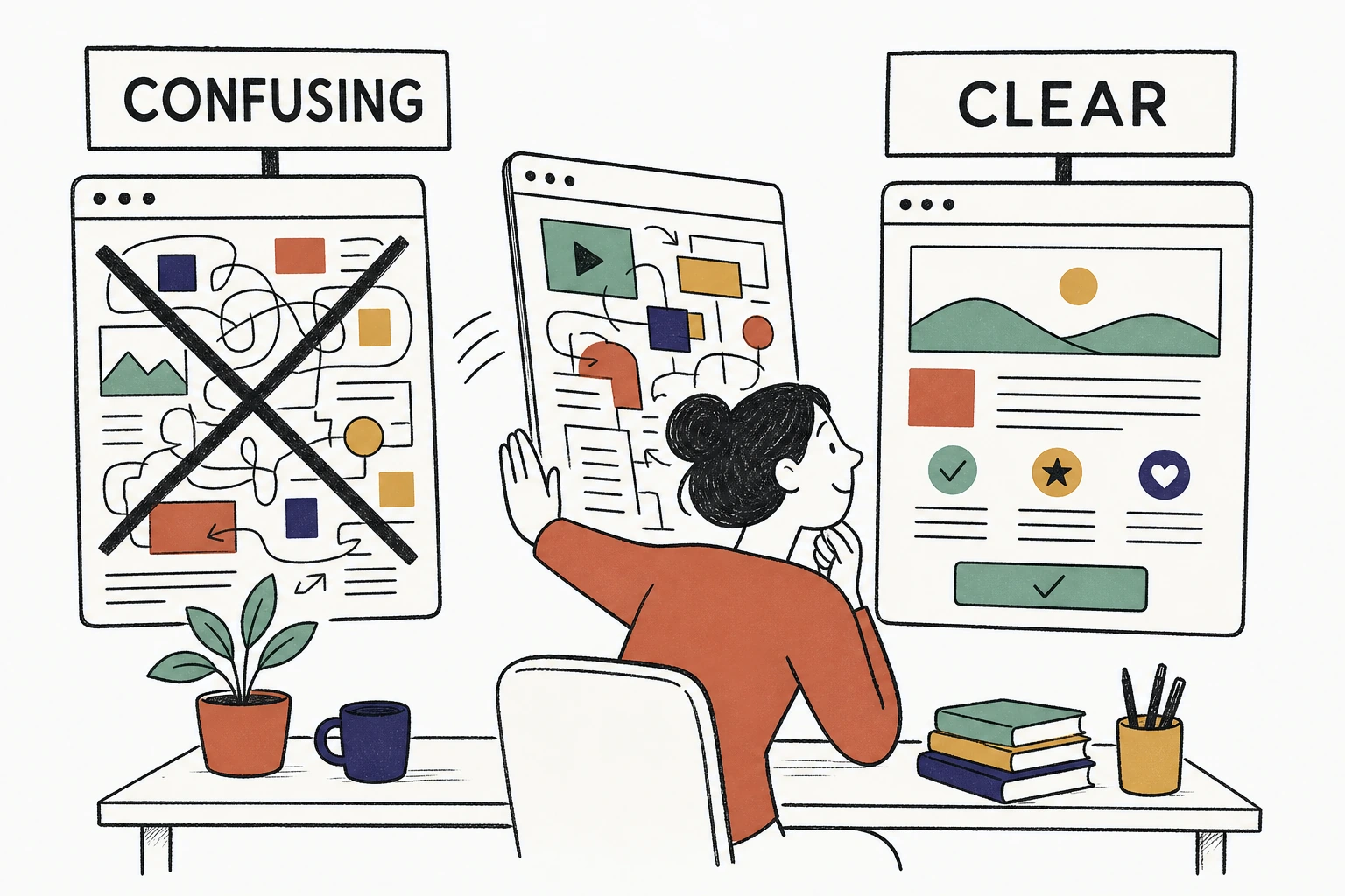
Here is the problem with most law, accounting, consulting, and agency sites. They were built to signal prestige, so they lead with awards, mission statements, and a wall of jargon. But the person reading is anxious and in a hurry. They have a problem, a deadline, and three tabs open comparing you to two competitors. If your page makes them work to understand what you do and how to start, they close the tab.
Not sure how quickly a stranger understands your firm. Run your site through the free Mirin scorecard. Sixty seconds, no signup.
Hidden expertise versus expertise you can buy
What making expertise easier to buy actually means
It means a stranger can understand what you do, believe you can do it, and take the first step, all in under a minute, without emailing to ask a basic question.
Buying a professional service is a leap of trust. The client cannot inspect the work before they commit, so they read the site the way they would read a face. They are asking three quiet questions. Do you solve my specific problem. Can I trust you with it. How do I start without feeling foolish. A site that answers all three, in plain words, is a site that is easy to buy from.
The window to answer is short. In a Nielsen Norman Group analysis of how long people stay on pages, most visits are brief and the risk of a user leaving is highest in the first ten to twenty seconds. "To gain several minutes of user attention, you must clearly communicate your value proposition within 10 seconds," wrote Jakob Nielsen, who directed the research. If your homepage spends those seconds on a mission statement, the buyer is already gone.
Why the way it looks decides whether they trust you
A buyer will not hand a serious problem to a firm whose site looks neglected, because the design is the only sample of your work they can see yet.
Before anyone reads a word, they judge. In the Stanford Web Credibility Project, based on three years of research with more than 4,500 people, 46.1 percent of people judged a site's credibility in part on its visual design, the layout, typography, and color. "People do judge a website by how it looks," said B.J. Fogg, the Stanford psychologist who directed the research.
For a professional service that verdict carries extra weight, because your website is a proxy for your judgment. If the site is cluttered, dated, or hard to read, the buyer quietly assumes the work will be too. The look of the page has to earn trust before a single credential gets read.
How a buyer vets three firms at once
Why proof beats adjectives every time
A stranger does not believe you are experienced because you wrote experienced. They believe the proof they can check.
Words like trusted, dedicated, and results driven are invisible, because every competitor uses them. What a careful buyer looks for is verifiable proof. Named client results with numbers. Real reviews with real names. Credentials, bar admissions, certifications, case studies, and the actual people who will do the work, with faces and bios. Reviews in particular do heavy lifting for local firms. In BrightLocal's Local Consumer Review Survey, the overwhelming majority of consumers read online reviews when evaluating local businesses, and a strong star rating is often the filter that decides who even makes the shortlist.
Prestige told is skippable. Proof shown is what converts anxiety into a consult.
See exactly where a buyer gives up trying to hire you.
Send Mirin your firm's site. We grade the things that decide a hire, a clear service, visible proof, an easy consult, and plain language, and tell you what to fix first.
Run the free scorecard- Paste your site URL
- We grade it in seconds
- You see the gaps
- You decide
Why the consult has to be one obvious step
Every extra step between wanting to talk to you and booking a time is a place the ready buyer quietly leaves.
Most firms bury the first step. The only path is a generic contact form that promises someone will get back to you, or a phone number that answers during business hours. But the buyer decided at nine at night, after a stressful day, in the narrow window where they were ready to act. A form that disappears into an inbox is a wall. A visible Book a Consult button that lets them claim a time on the spot is a door. And most of them are on a phone when it happens. According to Think with Google, 76 percent of people who search for something nearby on their smartphone visit a related business within a day. They are ready now. The firm that lets them start now is the one they hire.
What a homepage that sells expertise is built from
Across the professional services homepages we have built at Mirin, for lawyers, accountants, consultants, and agencies, the single change that moved inquiries most was not a better bio or a longer credentials list. It was replacing the buried contact form with a persistent Book a Consult button that follows the buyer down the whole page. The people who used to read, hesitate, and leave started booking instead. The decision moved from a maybe they would email about to a time on the calendar.
Why plain language sells expertise better than jargon
The buyer is not an expert in your field. That is exactly why they are hiring you.
Jargon feels safe to write because it sounds credentialed, but to the reader it is friction. A page that says holistic strategic advisory across the deal lifecycle tells a nervous buyer nothing. A page that says we help you sell your business for the right price, without surprises earns the click. Say what you do in the words the client would use to describe their own problem. Plain language is not dumbing down your expertise. It is the proof that you understand the client well enough to explain their problem back to them.
The parts to cut and the parts to keep
Cut everything that makes the buyer work. Keep everything that answers can this firm solve my problem and how do I start.
Cut the corporate mission statement, the stock photo of a handshake, the wall of adjectives, the jargon nobody outside your office uses, and the contact form that stands in for booking. Keep the plain description of what you do and for whom, the named results and real reviews, the credentials and the faces of your team, the honest starting price or engagement range, and a Book a Consult button that never leaves the screen. The easiest firm to buy from is not the one with the most impressive words. It is the one that removed the most friction between wanting help and getting it.
How to make your firm's site easier to buy from without a rebuild
Most of these fixes are a decision, not a project, and you should not have to make them between client meetings.
For $199 a month, Mirin builds the site, hosts it, and makes the changes for you, with a clear service description, visible proof, an obvious consult button, and plain language throughout. You tell Mirin in plain words what changed, a new practice area, a new case result, a new price, a new booking link, and Mirin makes the edit, shows you a preview, and publishes it. No request queue, no invoice per change. See the full breakdown on Mirin pricing, or how the handled model works on the Mirin platform page.
See your firm's site rebuilt so a buyer can hire you in one step.
Send Mirin your current site. We will shape a preview around the moment someone decides to hire you, the clear service, the proof, the easy consult, and plain language, so you can see the buyable version before you pay.
Get my preview- Send your current site
- We shape a buyable preview
- You review the hire path
- You decide, live in days
The repeatable rule: make expertise easy to buy. A professional services website that works is not the most prestigious one. It is the one that says plainly what you do, proves you can be trusted, and makes the first step a single tap, so the buyer who was ready to hire someone hires you.


