
A fitness studio or gym website fills classes when it sells the first visit, not the annual membership. Put one obvious offer on every screen, a free class or a low-cost intro week, and let someone claim it from their phone in under a minute. Show the real schedule, real prices, and real photos of your room and your coaches. The membership sells itself once someone has stood in the room once.
That is the whole answer. Sell the first visit. Everything else on the page is in service of getting one nervous person through the door for one class.
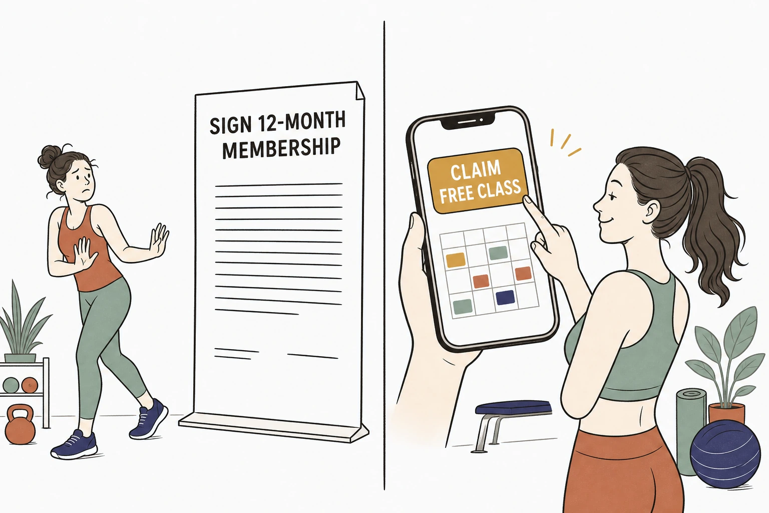
Here is the problem with most studio and gym sites. They were built to sell a twelve month membership to someone who has never tried a class. But nobody signs a year long contract with a place they have never sweated in. They want to try one class first, quietly, without a sales call. If your site cannot hand them that first class, the studio down the road will.
Not sure what a first-timer runs into on your current site. Run it through the free Mirin scorecard. Sixty seconds, no signup.
The membership brochure versus the first-visit page
What selling the first visit actually means
It means the single most prominent thing on your homepage is an invitation to come in once, free or nearly free, and the person can accept it on their phone without talking to anyone.
Selling the first visit is not a discount gimmick. It is matching what the page asks for to what the visitor is actually ready to give. A stranger is not ready to commit to a year. They are ready to try a 6am class on Thursday. So the page leads with the free class or the intro week, shows the schedule so they can picture themselves in a slot, and lets them claim it in the moment the courage is there.
The demand for group classes is real, not a nice-to-have. In the Health & Fitness Association's 2025 US Health & Fitness Consumer Report, 32.3 percent of fitness facility members took part in small-group training, and the report counted 77 million facility members across the country. "The new report illustrates how Americans are blending equipment, formats, and coaching," said Anton Severin, Vice President of Research at the HFA. Classes are how a lot of people meet a studio. The first visit is usually a class, so the website should sell a class.
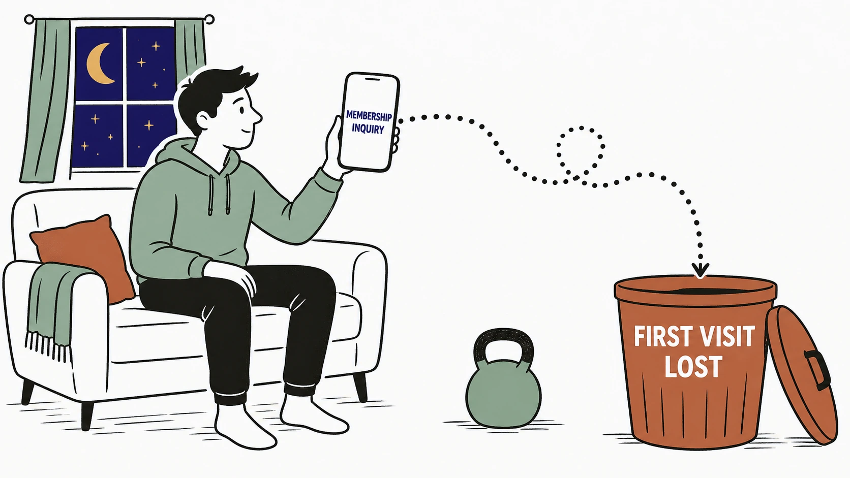
Why the membership-first site quietly loses the first visit
Every site that leads with "Become a Member" asks for the one thing a stranger is least ready to give, so most of them leave.
Picture the person you are losing. They found you at 9pm after deciding, again, that this is the year. They want to see if the room feels right, if the class times fit around work, if the coaches look like people they would not be embarrassed in front of. Your homepage answers with a membership pitch and a "Contact us for pricing" form. So they close the tab. The nerve it took to look you up cools while they wait for a callback that turns the whole thing into a sales conversation they did not want.
Where the first visit goes to die
And they are ready to move now, not next week. According to Think with Google, 76 percent of people who search for something nearby on their smartphone visit a related business within a day. Someone searching "yoga near me" or "gym class tonight" is deciding today. A site that makes them wait for a sales call hands that ready person to whoever let them just book the class.
Why the way it looks decides whether they show up
A first-timer will not book a class at a place whose website looks neglected, because the site is the only evidence they have of the room.
Before anyone reads a word, they judge. In the Stanford Web Credibility Project, based on three years of research with more than 4,500 people, 46.1 percent of people judged a site's credibility in part on its visual design, the layout, the typography, the color. "People do judge a website by how it looks," said B.J. Fogg, the Stanford psychologist who directed the research.
For a studio that verdict cuts deeper, because you are selling a physical space someone has to walk into alone. A cramped, dated, stock-photo homepage does not read as neutral. It reads as a room that might be just as tired, with a class that might be intimidating, run by people who might not notice if they slip out early. The look of the site has to earn the visit before the schedule ever gets a chance.
See exactly where a first-timer would give up trying to visit you.
Send Mirin your studio or gym site. We grade the things that decide a first visit, the free-class offer, mobile ease, the live schedule, real photos, and clear intro pricing, and tell you what to fix first.
Run the free scorecard- Paste your site URL
- We grade it in seconds
- You see the gaps
- You decide
What a fitness studio homepage that fills classes actually does
It does four plain things a first-timer can act on immediately, not four things a brand agency admires.
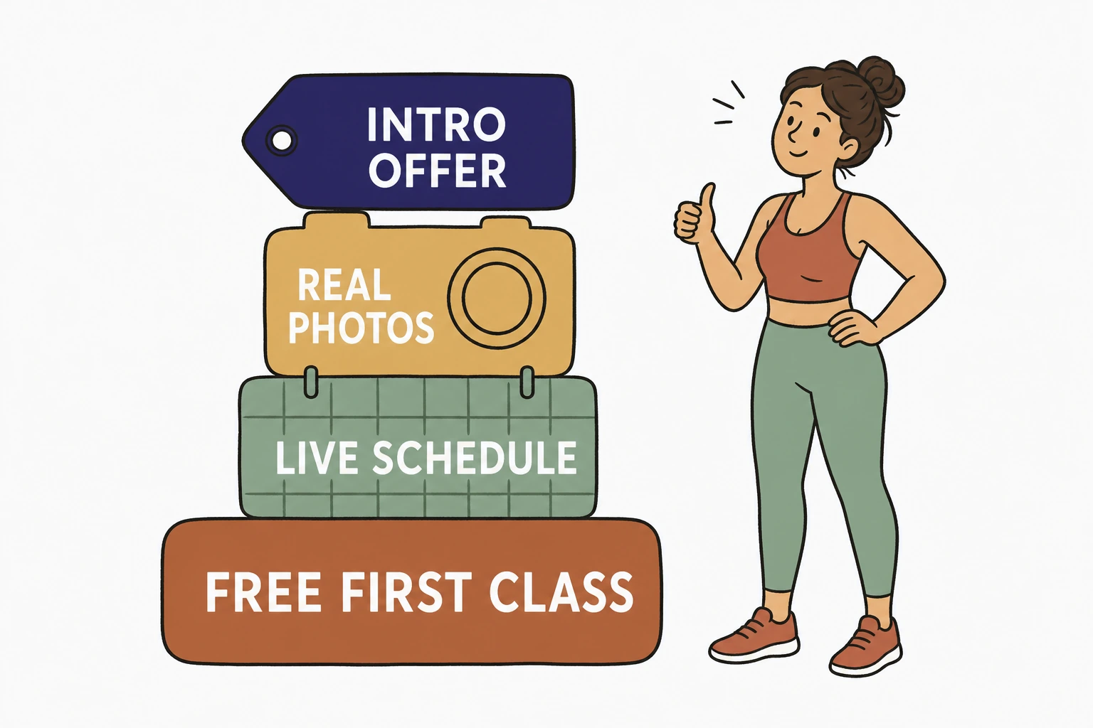
Lead with the first visit, a free class or a cheap intro week, as a button that follows the person down every screen. Show the real class schedule right on the page so they can find a time that fits before they commit to anything. Show real photos of your actual room, your actual coaches, and real members mid-class, not stock models with impossible abs in a gym that is not yours. And name the intro price and what a membership costs after, because a hidden price reads as the highest price and sends the careful first-timer to the studio that just told them.
What a first-visit homepage is built from
Across the fitness and studio homepages we have built at Mirin, the single change that moved first visits most was not a slicker hero video. It was replacing the "Become a Member" headline with a persistent "Claim your free class" button and putting the real weekly schedule right under it. The people who used to bounce looking for a phone number started picking a class time instead. The relationship moved from a membership pitch a stranger dodged to a first class a stranger actually showed up for.
The parts to cut and the parts to keep
Cut everything that asks for commitment before trust. Keep everything that answers the one question the first-timer is asking, can I try this once without it being a whole thing.
Cut the full-screen membership pitch, the "Contact us for pricing" wall, the autoplay hype reel that eats a mobile screen, the stock photos of a gym that is not yours. Keep the free-class or intro offer as the loudest thing on the page, the live schedule, the real photos of your room and your coaches, the honest intro and membership prices, and the address and map so they know it is close. The site that fills classes is not the one with the most features. It is the one that removed the most friction between wanting to try and standing in the room.
How to make your studio site sell the first visit without a rebuild
Most of these fixes are a decision, not a construction project, and you should not have to make them at the front desk between classes.
For $199 a month, Mirin builds the site, hosts it, and makes the changes for you, with the free-class offer up front, a phone-first layout, the live schedule, real photos, and clear intro pricing. You tell Mirin in plain language what changed, a new class time, a new coach, a new intro offer, a new booking link, and Mirin makes the edit, shows you a preview, and publishes it. No request queue, no invoice per change. See the full breakdown on Mirin pricing, or how the handled model works on the Mirin platform page.
See your studio site rebuilt so a stranger can claim a free class in one tap.
Send Mirin your current site. We will shape a preview around the first visit, the free-class offer, the live schedule, real photos, and honest pricing, so you can see the version that fills classes before you pay.
Get my preview- Send your current site
- We shape a first-visit preview
- You review the free-class flow
- You decide, live in days
The repeatable rule: sell the first visit. A fitness studio website that fills classes is not the one with the boldest membership pitch. It is the one that gets a nervous stranger through the door for one class, because that first visit is where every membership actually begins.


